给 SwiftUI 开发者的 Flutter 指南
学习在构建 Flutter 应用时运用 SwiftUI 开发经验。
想用 Flutter 编写移动应用的 SwiftUI 开发者应阅读本指南,说明如何将现有 SwiftUI 知识应用于 Flutter。
Flutter 是一个用于构建跨平台应用的框架。它使用 Dart 编程语言。如果要了解 Dart 编程与 Swift 编程之间的某些差异,请参阅 Swift 开发者学习 Dart 指南 和 给 Swift 开发者的 Flutter 并发指南。
在使用 Flutter 进行开发时,你的 SwiftUI 知识和经验非常宝贵。
Flutter 还针对在 iOS 和 macOS 上运行的应用行为进行了一系列调整。如果需要了解具体方法,请参阅 平台适配。
你可以在当前文档随意浏览并查找最符合你需要的内容。当前指南嵌入了示例代码。你可以通过悬停或聚焦时出现的 "Open in DartPad" 按钮,在 DartPad 上打开并运行部分示例。
概览
#你可以观看以下视频来进行了解。该视频概述了 Flutter 在 iOS 上的工作原理,以及如何使用 Flutter 构建 iOS 应用。
Flutter 和 SwiftUI 的代码描述了 UI 的外观和行为。开发者将此类代码称为 声明式框架。
View 与 Widget
#SwiftUI 将 UI 组件表示为 view,通过 modifier 配置 view。
Text("Hello, World!") // <-- This is a View
  .padding(10)        // <-- This is a modifier of that View
Flutter 将 UI 组件表示为 widget。
view 与 widget 仅在需要变更前存在,称为 immutability(不可变性)。 SwiftUI 用 View modifier 表示 UI 组件属性; Flutter 则用 widget 同时表示 UI 组件及其属性。
Padding(                         // <-- This is a Widget
  padding: EdgeInsets.all(10.0), // <-- So is this
  child: Text("Hello, World!"),  // <-- This, too
)));
组合布局时,SwiftUI 与 Flutter 都嵌套 UI 组件:SwiftUI 嵌套 View,Flutter 嵌套 Widget。
布局过程
#SwiftUI 按以下过程布局 view:
父 view 向子 view 提议尺寸。
-
所有后续子 view:
向 其 子 view 提议尺寸
询问子 view 期望尺寸
每个父 view 按返回的尺寸渲染子 view。
Flutter 的过程略有不同:
-
父 widget 向子级传递约束,包括高度与宽度的最小值和最大值。
-
子 widget 会尝试决定自身的尺寸,并对它自己的子级列表重复相同的过程:
告知其子级所受的约束。
询问其子级希望的尺寸。
-
父级对子级进行布局。
若请求的尺寸符合约束,父级就采用该尺寸。
若请求的尺寸不符合约束,父级会限制高度、宽度或两者,使其符合约束。
Flutter 与 SwiftUI 不同在于父组件可覆盖子组件期望尺寸; widget 不能任意尺寸,也无法知晓或决定屏幕位置,由父组件决定。
要强制子 widget 以特定尺寸渲染,父级须设置紧约束;最小尺寸等于最大尺寸时为紧约束。
在 SwiftUI 中,view 可扩展到可用空间或限制为内容尺寸。 Flutter widget 行为类似。
但 Flutter 父 widget 可提供无界约束,最大值设为无穷。
UnboundedBox(
  child: Container(
      width: double.infinity, height: double.infinity, color: red),
)
若子级扩展且有无界约束,Flutter 会返回溢出警告:
UnconstrainedBox(
  child: Container(color: red, width: 4000, height: 50),
)
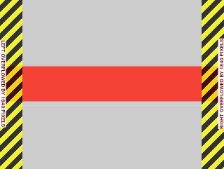
要了解 Flutter 中约束的工作原理,请参阅 理解布局约束。
设计系统
#Flutter 面向多平台,应用不必遵循特定设计系统。本指南使用 Material widget,但可采用多种设计系统:
自定义 Material widget
社区构建的 widget
你自己的自定义 widget
-
遵循 Apple 人机界面指南的 Cupertino widgets
参考自定义设计系统的优秀应用请参阅 Wonderous。
UI 基础
#本节涵盖 Flutter UI 基础及与 SwiftUI 的对比,包括入门、静态文本、按钮、点击响应、列表与网格等。
入门
#在 SwiftUI 中,用 App 启动应用。
@main
struct MyApp: App {
  var body: some Scene {
    WindowGroup {
      HomePage()
    }
  }
}
另一常见做法将应用 body 放在符合 View 协议的 struct 中,如下:
struct HomePage: View {
  var body: some View {
    Text("Hello, World!")
  }
}
启动 Flutter 应用时,将应用实例传给 runApp。
void main() {
  runApp(const MyApp());
}
App 是 widget,build 方法描述所代表的用户界面。通常以 WidgetApp
类(如 CupertinoApp)开始。
class MyApp extends StatelessWidget {
const MyApp({super.key});
@override
Widget build(BuildContext context) {
// Returns a CupertinoApp that, by default,
// has the look and feel of an iOS app.
return const CupertinoApp(home: HomePage());
}
}
HomePage 中的 widget 可能以 Scaffold 开始,实现应用基本布局结构。
class HomePage extends StatelessWidget {
const HomePage({super.key});
@override
Widget build(BuildContext context) {
return const Scaffold(body: Center(child: Text('Hello, World!')));
}
}
注意 Flutter 使用 Center。
SwiftUI 默认将 view 内容居中渲染,Flutter 并非总是如此;Scaffold 不会将 body
居中。要居中文本请用 Center 包裹,详见 核心 Widget 目录。
添加按钮
#在 SwiftUI 中,用 Button 结构体创建按钮。
Button("Do something") {
  // this closure gets called when your
  // button is tapped
}
在 Flutter 中,用 CupertinoButton 类达到相同效果:
CupertinoButton(
  onPressed: () {
    // This closure is called when your button is tapped.
  },
  const Text('Do something'),
),
Flutter 提供多种预定义样式按钮。
CupertinoButton
来自 Cupertino 库,其 widget 使用 Apple 设计系统。
水平对齐组件
#在 SwiftUI 中,stack view 在布局中很重要,有两种结构:
HStack用于水平 stack viewVStack用于垂直 stack view
以下 SwiftUI view 在水平 stack 中添加地球图标与文本:
HStack {
  Image(systemName: "globe")
  Text("Hello, world!")
}
Flutter 使用 Row
而非 HStack:
Row(
  mainAxisAlignment: MainAxisAlignment.center,
  children: [Icon(CupertinoIcons.globe), Text('Hello, world!')],
),
Row 的 children 需 List<Widget>;
mainAxisAlignment 控制额外空间中的子项位置,MainAxisAlignment.center 将子项放在主轴中心;
Row 的主轴为水平轴。
垂直对齐组件
#以下示例建立在上一节基础上。
在 SwiftUI 中,用 VStack 将组件垂直排列。
VStack {
  Image(systemName: "globe")
  Text("Hello, world!")
}
Flutter 使用与上一示例相同的 Dart 代码,但将 Row
换为 Column:
Column(
  mainAxisAlignment: MainAxisAlignment.center,
  children: [Icon(CupertinoIcons.globe), Text('Hello, world!')],
),
显示列表视图
#
在 SwiftUI 中,用 List 显示项序列;要显示模型对象序列,须使用户能识别模型对象,对象需符合 Identifiable 协议。
struct Person: Identifiable {
var name: String
}
var persons = [
Person(name: "Person 1"),
Person(name: "Person 2"),
Person(name: "Person 3"),
]
struct ListWithPersons: View {
let persons: [Person]
var body: some View {
List {
ForEach(persons) { person in
Text(person.name)
}
}
}
}
这与 Flutter 构建列表 widget 的方式类似; Flutter 不要求列表项可识别,你设置项数并为每项构建 widget。
class Person {
String name;
Person(this.name);
}
final List<Person> items = [
Person('Person 1'),
Person('Person 2'),
Person('Person 3'),
];
class HomePage extends StatelessWidget {
const HomePage({super.key});
@override
Widget build(BuildContext context) {
return Scaffold(
body: ListView.builder(
itemCount: items.length,
itemBuilder: (context, index) {
return ListTile(title: Text(items[index].name));
},
),
);
}
}
Flutter 列表有一些注意事项:
-
ListViewwidget 提供了一个 builder 方法,其作用类似于 SwiftUIList结构体中的ForEach。 -
ListView的itemCount参数用于设置ListView显示的项目数量。 -
itemBuilder带有一个 index 参数,其取值范围在 0 到 itemCount 减 1 之间。
上面的示例为每个项目返回了一个 ListTile
widget。
ListTile widget 包含 height、font-size 等属性,这些属性有助于构建列表。不过,Flutter 允许你返回几乎任何能表示你数据的 widget。
显示网格
#在 SwiftUI 中构建非条件网格时,使用 Grid 与 GridRow。
Grid {
  GridRow {
    Text("Row 1")
    Image(systemName: "square.and.arrow.down")
    Image(systemName: "square.and.arrow.up")
  }
  GridRow {
    Text("Row 2")
    Image(systemName: "square.and.arrow.down")
    Image(systemName: "square.and.arrow.up")
  }
}
在 Flutter 中用 GridView
widget 显示网格,有多种构造函数,以下使用 .builder() 初始化:
const widgets = <Widget>[
Text('Row 1'),
Icon(CupertinoIcons.arrow_down_square),
Icon(CupertinoIcons.arrow_up_square),
Text('Row 2'),
Icon(CupertinoIcons.arrow_down_square),
Icon(CupertinoIcons.arrow_up_square),
];
class HomePage extends StatelessWidget {
const HomePage({super.key});
@override
Widget build(BuildContext context) {
return Scaffold(
body: GridView.builder(
gridDelegate: const SliverGridDelegateWithFixedCrossAxisCount(
crossAxisCount: 3,
mainAxisExtent: 40,
),
itemCount: widgets.length,
itemBuilder: (context, index) => widgets[index],
),
);
}
}
SliverGridDelegateWithFixedCrossAxisCount delegate 决定了网格用来布局其组件的各种参数,其中包括决定每行显示项目数量的 crossAxisCount。
SwiftUI 的 Grid 与 Flutter 的 GridView 的区别在于 Grid 需要 GridRow;
GridView 用 delegate 决定布局。
创建滚动视图
#
在 SwiftUI 中,用 ScrollView 创建自定义滚动组件,以下示例以可滚动方式显示一系列 PersonView。
ScrollView {
  VStack(alignment: .leading) {
    ForEach(persons) { person in
      PersonView(person: person)
    }
  }
}
Flutter 用 SingleChildScrollView
创建滚动视图,以下 mockPerson 模拟 Person 实例创建 PersonView。
SingleChildScrollView(
  child: Column(
    children: mockPersons
        .map((person) => PersonView(person: person))
        .toList(),
  ),
),
响应式与自适应设计
#在 SwiftUI 中,用 GeometryReader 创建相对 view 尺寸。
例如,你可以:
-
将
geometry.size.width乘以某个因子来设置 width。 -
将
GeometryReader用作断点以更改应用设计。
还可用 horizontalSizeClass 查看 size class 为 .regular 或 .compact。
在 Flutter 中创建相对视图有两种方式:
-
在
LayoutBuilder类中获取BoxConstraints对象。 -
在 build 函数中使用
MediaQuery.of()获取当前应用的尺寸和方向。
要了解更多内容,请参阅 创建响应式与自适应应用。
管理状态
#在 SwiftUI 中,用 @State 属性包装器表示 SwiftUI view 的内部状态。
struct ContentView: View {
  @State private var counter = 0;
  var body: some View {
    VStack{
      Button("+") { counter+=1 }
      Text(String(counter))
    }
  }}
SwiftUI 还有 ObservableObject 等更复杂状态管理选项。
Flutter 使用 StatefulWidget
管理局部状态。通过以下两个类来实现一个 stateful widget:
StatefulWidget的一个子类State的一个子类
State 对象存储着 widget 的状态。要改变 widget 的状态,可在 State 子类中调用 setState(),以通知框架重绘该 widget。
以下示例展示了一个计数器应用的部分代码:
class MyHomePage extends StatefulWidget {
const MyHomePage({super.key});
@override
State<MyHomePage> createState() => _MyHomePageState();
}
class _MyHomePageState extends State<MyHomePage> {
int _counter = 0;
@override
Widget build(BuildContext context) {
return Scaffold(
body: Center(
child: Column(
mainAxisAlignment: MainAxisAlignment.center,
children: [
Text('$_counter'),
TextButton(
onPressed: () => setState(() {
_counter++;
}),
child: const Text('+'),
),
],
),
),
);
}
}
要了解更多管理状态的方式,请参阅 状态管理。
动画
#UI 动画主要有两类。
隐式:从当前值动画到新目标。
显式:按需动画。
隐式动画
#SwiftUI 与 Flutter 动画方式相似,都指定 duration、curve 等参数。
在 SwiftUI 中,用 animate() modifier 处理隐式动画。
Button("Tap me!"){
   angle += 45
}
.rotationEffect(.degrees(angle))
.animation(.easeIn(duration: 1))
Flutter 有隐式动画 widget,简化常见 widget 动画,命名格式为 AnimatedFoo。
例如旋转按钮用 AnimatedRotation,为
Transform.rotate widget 添加动画。
AnimatedRotation(
  duration: const Duration(seconds: 1),
  turns: turns,
  curve: Curves.easeIn,
  TextButton(
    onPressed: () {
      setState(() {
        turns += .125;
      });
    },
    const Text('Tap me!'),
  ),
),
Flutter 可创建自定义隐式动画,用 TweenAnimationBuilder
组合新动画 widget。
显式动画
#显式动画方面,SwiftUI 用 withAnimation()。
Flutter 有显式动画 widget,命名如 FooTransition,例如 RotationTransition。
Flutter 还可用 AnimatedWidget 或 AnimatedBuilder 创建自定义显式动画。
更多动画信息请参阅 动画概览。
在屏幕上绘制
#在 SwiftUI 中,用 CoreGraphics 在屏幕上绘制线条与形状。
Flutter 基于 Canvas 类提供 API,有两个辅助类:
-
需要一个 painter 的
CustomPaint:dartCustomPaint( painter: SignaturePainter(_points), size: Size.infinite, ), -
实现你的算法、负责将内容绘制到画布上的
CustomPainter。dartclass SignaturePainter extends CustomPainter { SignaturePainter(this.points); final List<Offset?> points; @override void paint(Canvas canvas, Size size) { final Paint paint = Paint() ..color = Colors.black ..strokeCap = StrokeCap.round ..strokeWidth = 5; for (int i = 0; i < points.length - 1; i++) { if (points[i] != null && points[i + 1] != null) { canvas.drawLine(points[i]!, points[i + 1]!, paint); } } } @override bool shouldRepaint(SignaturePainter oldDelegate) => oldDelegate.points != points; }
导航
#本节说明应用页面间导航、push/pop 机制等。
在页面间导航
#开发者使用称为 navigation routes(导航路由)的不同页面来构建 iOS 与 macOS 应用。
在 SwiftUI 中,NavigationStack 表示该页面栈。
以下示例创建显示人员列表的应用,点击人员在新的导航链接中显示详情。
NavigationStack(path: $path) {
  List {
    ForEach(persons) { person in
      NavigationLink(
        person.name,
        value: person
      )
    }
  }
  .navigationDestination(for: Person.self) { person in
    PersonView(person: person)
  }
}
若无复杂链接的小型 Flutter 应用,可用 Navigator
命名路由;定义路由后按名称调用。
-
在传给
runApp()函数的类中为每条路由命名,以下示例使用App:dart// Defines the route name as a constant // so that it's reusable. const detailsPageRouteName = '/details'; class App extends StatelessWidget { const App({super.key}); @override Widget build(BuildContext context) { return CupertinoApp( home: const HomePage(), // The [routes] property defines the available named routes // and the widgets to build when navigating to those routes. routes: {detailsPageRouteName: (context) => const DetailsPage()}, ); } }下面的示例使用
mockPersons()生成一个人员列表。点击某个人员时,会使用pushNamed()将该人员的详情页推入Navigator。dartListView.builder( itemCount: mockPersons.length, itemBuilder: (context, index) { final person = mockPersons.elementAt(index); final age = '${person.age} years old'; return ListTile( title: Text(person.name), subtitle: Text(age), trailing: const Icon(Icons.arrow_forward_ios), onTap: () { // When a [ListTile] that represents a person is // tapped, push the detailsPageRouteName route // to the Navigator and pass the person's instance // to the route. Navigator.of( context, ).pushNamed(detailsPageRouteName, arguments: person); }, ); }, ), -
定义用于显示每个人员详情的
DetailsPagewidget。在 Flutter 中,导航到新路由时可以向 widget 传入参数,并使用ModalRoute.of()提取这些参数。dartclass DetailsPage extends StatelessWidget { const DetailsPage({super.key}); @override Widget build(BuildContext context) { // Read the person instance from the arguments. final Person person = ModalRoute.of(context)?.settings.arguments as Person; // Extract the age. final age = '${person.age} years old'; return Scaffold( // Display name and age. body: Column(children: [Text(person.name), Text(age)]), ); } }
更高级导航需求可使用 go_router 等路由 package。
更多内容请参阅 导航与路由。
手动返回
#在 SwiftUI 中,用 dismiss 环境值返回上一屏。
Button("Pop back") {
  dismiss()
}
在 Flutter 中,用 Navigator 类的 pop():
TextButton(
  onPressed: () {
    // This code allows the
    // view to pop back to its presenter.
    Navigator.of(context).pop();
  },
  child: const Text('Pop back'),
),
导航到其他应用
#在 SwiftUI 中,用 openURL 环境变量打开其他应用的 URL。
@Environment(\.openURL) private var openUrl
// View code goes here
Button("Open website") {
openUrl(
URL(
string: "https://google.com"
)!
)
}
在 Flutter 中,使用 url_launcher
插件。
CupertinoButton(
  onPressed: () async {
    await launchUrl(Uri.parse('https://google.com'));
  },
  const Text('Open website'),
),
主题、样式与媒体
#可轻松设置 Flutter 应用样式,包括主题切换、文本与 UI 组件设计等。
使用深色模式
#在 SwiftUI 中,在 View 上调用 preferredColorScheme() 使用深色模式。
在 Flutter 中,可在应用级用 App 的 theme 控制亮度模式。
const CupertinoApp(
  theme: CupertinoThemeData(brightness: Brightness.dark),
  home: HomePage(),
);
设置文本样式
#在 SwiftUI 中,用 modifier 设置文本样式,例如用 font() 修改 Text 字体。
Text("Hello, world!")
  .font(.system(size: 30, weight: .heavy))
  .foregroundColor(.yellow)
在 Flutter 中,将 TextStyle 作为 Text 的 style 参数。
Text(
  'Hello, world!',
  style: TextStyle(
    fontSize: 30,
    fontWeight: FontWeight.bold,
    color: CupertinoColors.systemYellow,
  ),
),
设置按钮样式
#在 SwiftUI 中,用 modifier 设置按钮样式。
Button("Do something") {
  // Do something when the button is tapped.
}
.font(.system(size: 30, weight: .bold))
.background(Color.yellow)
.foregroundColor(Color.blue)
在 Flutter 中,设置子项样式或修改按钮属性。
在以下示例中:
-
CupertinoButton的color设置其颜色。 -
子
Textwidget 的color设置按钮文字颜色。
child: CupertinoButton(
  color: CupertinoColors.systemYellow,
  onPressed: () {},
  child: const Text(
    'Do something',
    style: TextStyle(
      color: CupertinoColors.systemBlue,
      fontSize: 30,
      fontWeight: FontWeight.bold,
    ),
  ),
),
使用自定义字体
#
在 SwiftUI 中,两步使用自定义字体:将字体文件加入项目,再用 .font() modifier 应用到 UI 组件。
Text("Hello")
  .font(
    Font.custom(
      "BungeeSpice-Regular",
      size: 40
    )
  )
在 Flutter 中,用 pubspec.yaml 管理平台无关的资源。添加自定义字体步骤:
-
在项目的根目录创建一个名为
fonts的文件夹。此步骤可选,有助于组织你的字体。 -
将你的
.ttf、.otf或.ttc字体文件放入fonts文件夹。 -
打开项目中的
pubspec.yaml文件。 找到
flutter部分。-
在
fonts部分下添加你的自定义字体。yamlflutter: fonts: - family: BungeeSpice fonts: - asset: fonts/BungeeSpice-Regular.ttf
添加字体后,可如下使用:
Text(
  'Cupertino',
  style: TextStyle(fontSize: 40, fontFamily: 'BungeeSpice'),
),
在应用中打包图片
#在 SwiftUI 中,先将图像加入 Assets.xcassets,再用 Image view 显示。
在 Flutter 中添加图像的方式类似自定义字体。
-
在根目录添加一个
images文件夹。 -
在
pubspec.yaml文件中添加该资源。yamlflutter: assets: - images/Blueberries.jpg
添加图像后,用 Image widget 的 .asset() 构造函数显示。该构造函数:
使用提供的路径实例化给定的图像。
从随应用捆绑的资源中读取该图像。
在屏幕上显示该图像。
完整示例请参阅 Image 文档。
在应用中打包视频
#在 SwiftUI 中,两步捆绑本地视频:导入 AVKit,再实例化 VideoPlayer view。
在 Flutter 中,添加 video_player 插件,可从同一代码库在 Android、iOS 与 Web 上播放视频。
-
将该插件添加到你的应用,并将视频文件添加到项目中。
-
在
pubspec.yaml文件中添加该资源。 -
使用
VideoPlayerController类加载并播放你的视频文件。
完整教程请参阅 video_player 示例。
除非另有说明,本文档之所提及适用于 Flutter 3.44.0 版本。本页面最后更新时间:2026-06-14。查看文档源码 或者 为本页面内容提出建议。