Basic widgets
A catalog of Flutter's basic widgets. Widgets to know before building your first Flutter app.
Widgets to know before building your first Flutter app.
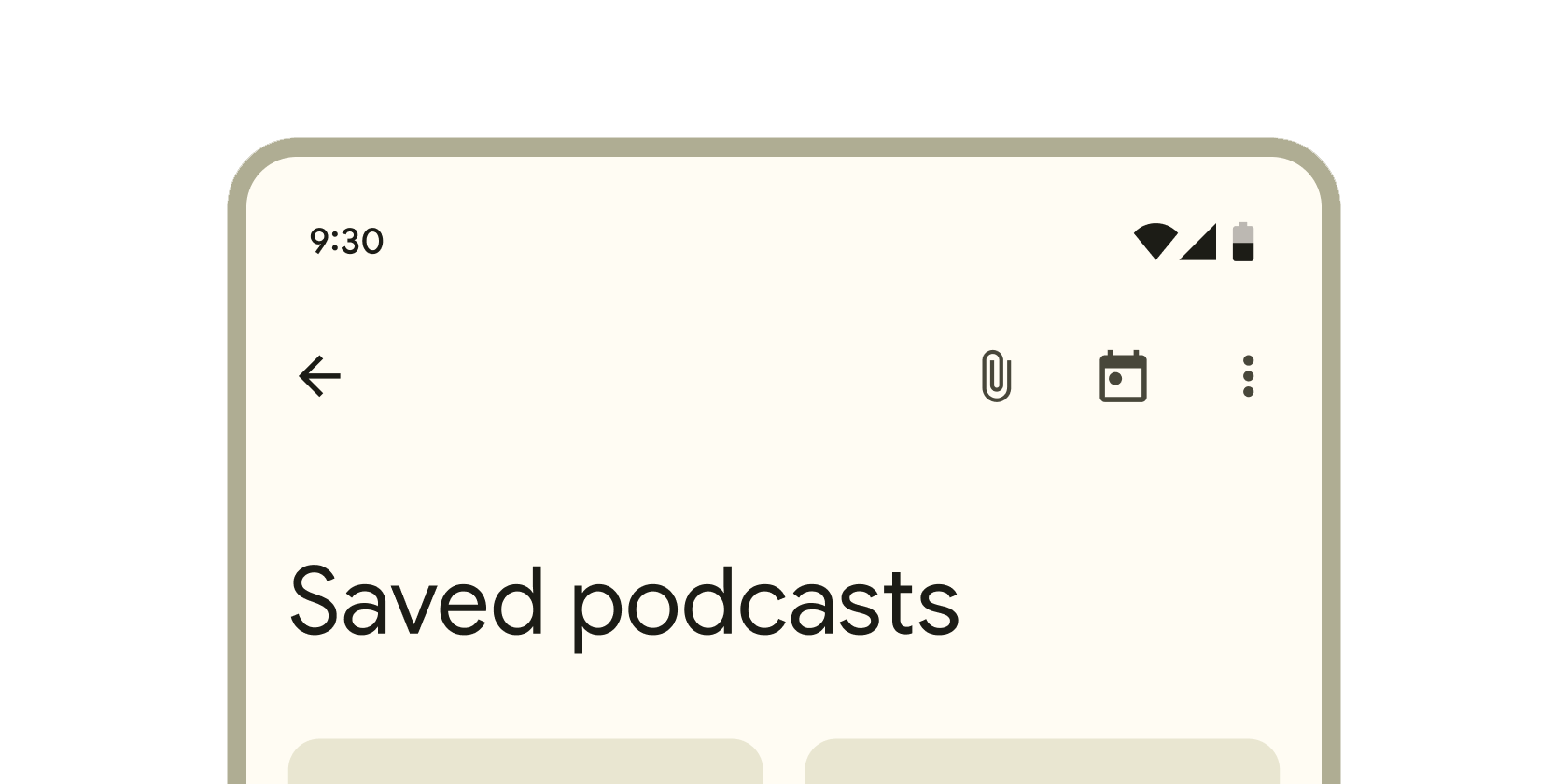
Container that displays content and actions at the top of a screen.
Layout a list of child widgets in the vertical direction.
A convenience widget that combines common painting, positioning, and sizing widgets.
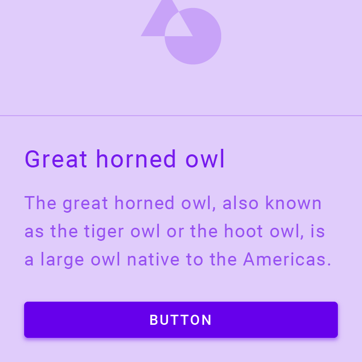
A Material Design elevated button. A filled button whose material elevates when pressed.

The Flutter logo, in widget form. This widget respects the IconTheme.
A Material Design icon.
A widget that displays an image.
A widget that draws a box that represents where other widgets will one day be added.
Layout a list of child widgets in the horizontal direction.
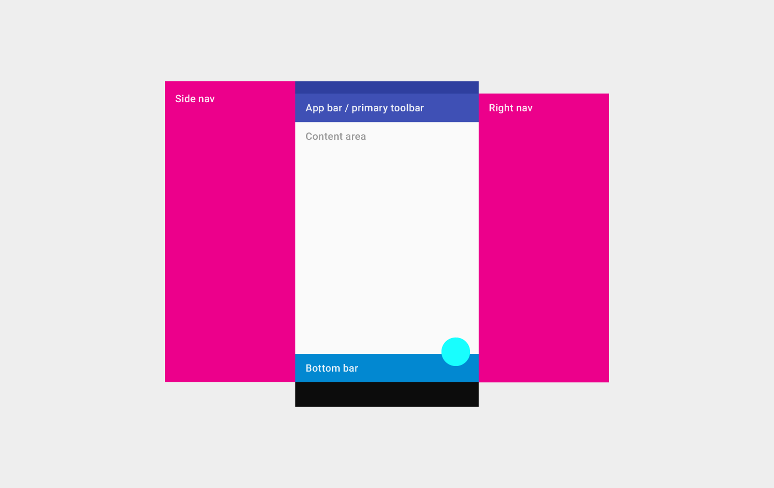
Implements the basic Material Design visual layout structure. This class provides APIs for showing drawers, snack bars, and bottom sheets.
A run of text with a single style.
更多 widget 请查看 widget 目录。
除非另有说明,本文档之所提及适用于 Flutter 3.44.0 版本。为本页面内容提出建议。