自动适配不同平台操作体验
了解更多 Flutter 的平台适配机制。
适配哲学
#平台适配通常有两种情形:
-
操作系统所特有的操作体验(例如文本编辑和滚动)。如果操作体验与操作系统不一致,则通常会被认为是「错误的」。
-
使用 OEM 提供的 SDK 实现的功能体验(例如 iOS 常使用的选项卡, Android 使用
android.app.AlertDialog显示一个提示窗口)。
本文囊括了 Flutter 为解决情形 1 而提供的覆盖 Android 和 iOS 的自动适配。
对于情形 2,Flutter 提供了一些工具可以生成符合平台习惯的体验,但是不会根据平台自动适配,需要根据 App 设计来手工选择。更多有关的讨论,请访问 issue #8410 和这个文档 定义 Material/Cupertino widget 适配问题
如果一个应用需要在 Android 和 iOS 不同架构上使用相同的代码,请参阅 platform_design 这份代码示例。
页面导航
#Flutter 分别为 Android 和 iOS 提供了各自平台的导航模式,并根据当前平台自动适配导航转场动画。
导航转场动画
#
Android 平台,默认提供的 Navigator.push()
转场动画模仿了 startActivity()
的动画,即一种自下而上的动画效果。
iOS 平台:
-
iOS 的
Navigator.push()API 提供了 iOS 上的 Show 转场动画(也被称为 Push 转场动画),即根据语言的方向设置,执行一种从后到前的滚动动画效果。在显示新页面的时候,原来的页面也会沿着相同的方向进行视差滚动。 -
当显示一个页面,且
PageRoute.fullscreenDialog是 true 的时候, iOS 提供了另外一种自下而上的动画效果。这个动画通常被用在展示全屏模态页,也被称为 iOS 上的 Present 转场动画或 Modal 转场动画。
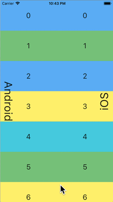
Android 转场动画
iOS Push 转场动画
iOS Present 转场动画
不同平台的转场动画细节
#
Android 平台上,Flutter 使用 ZoomPageTransitionsBuilder
转场动画。当用户进行了路由跳转,界面会缩放至下一个页面。当用户返回上一页时,界面会缩放回上一个页面。
当在 iOS 平台上使用 Push 转场特效的时候,
Flutter 内置的 CupertinoNavigationBar
和 CupertinoSliverNavigationBar
会自动的给当前页下一页的子组件使用正确的动画效果(CupertinoNavigationBar 或者 CupertinoSliverNavigationBar)。
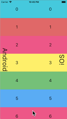
Android
iOS Nav Bar
返回导航
#
Android 平台,通常操作系统的返回按钮触发的事件会发给 Flutter,并弹出 WidgetsApp
路由的最顶端。
iOS 平台,从屏幕边缘的轻扫手势会弹出路由的最顶端。
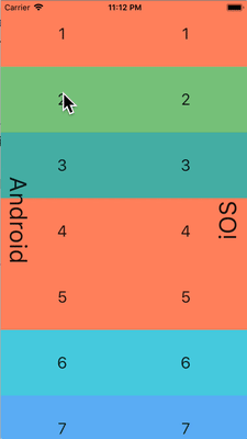
Android back button
iOS back swipe gesture
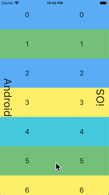
滚动
#滚动是不同平台提供独有体验非常重要的一环, Flutter 会根据当前的平台自动适配滚动体验。
物理仿真
#Android 和 iOS 平台都提供了非常复杂的滚动物理仿真,因而很难用语言来描述。通常来说, iOS 的滚动通常提供更多的分量和动态的阻力;而 Android 则更多的使用静态的阻力。所以,iOS 随着滚动慢慢的达到高速,且不会突然的停止,而且在慢速的时候显得更顺滑。
Soft fling comparison
Medium fling comparison
Strong fling comparison
滚动边界行为
#Android 平台,滚动达到边界的时候,会显示 滚动灰色指示 (具体颜色根据 Material 主题而有所不同)。
iOS 平台,滚动达到边界的时候,会显示一个 滚动边界 的弹簧效果。

Dynamic overscroll comparison
Static overscroll comparison
滚动条
#在 基于 Material 的平台(例如 Android 和 Web)上,滚动条通常会在滚动时显示,并且可能会根据平台和主题持续保持可见。
在 基于 Cupertino 的平台(例如 iOS)上,滚动条则更加简约,通常只在用户主动滚动时短暂出现,并在交互停止后淡出。
这种差异体现了各平台的视觉惯例,有助于在不同设备上保持原生的观感与体验。
动量
#iOS 平台,不停的按相同方向滚动会产生动量叠加,从而连续滚动速度会越来越快。在 Android 平台上没有对应的行为。
iOS scroll momentum
返回顶部
#iOS 平台,点击操作系统的状态栏,主要的滚动条控制器会滚动到顶部。 Android 没有对应的行为(部分国产系统自己实现了该特性)。
iOS status bar tap to top
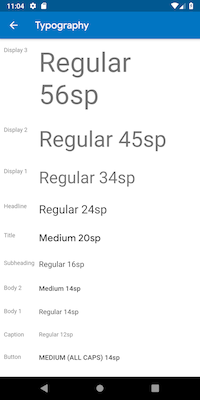
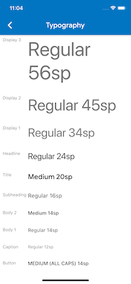
排版
#当使用 Material package 的时候,排版会根据平台自动使用对应的字体。 Android 平台会使用 Roboto 字体,而 iOS 则会使用系统自带的 San Francisco 字体。
当使用 Cupertino package 的时候,默认主题 会使用 San Francisco 字体。
San Francisco 字体的授权限制了它只能被用在运行于 iOS、macOS 和 tvOS 平台上的软件。因此当运行在 Android 平台的时候,即使强制覆盖系统平台为 iOS 或者使用 Cupertino 默认主题,都会使用对应的替代字体。
你可以选择将 Material widgets 的文本样式适配到 iOS 的默认文本样式。你可以在 UI 组件部分 看到特定组件的例子。
Roboto on Android
San Francisco on iOS
图标
#当使用 Material package 的时候,根据平台不同,图标的具体样式会有差别。举例来说,更多按钮的图标,Android 上是竖直的三个点而 iOS 是横着的三个点;退回按钮,iOS 是一个简单的 V 型标记,而 Android 平台,V 型标记有个短横线。

Icons on Android

Icons on iOS
Material 也通过 Icons.adaptive
提供了一系列根据平台自适应的图标。
触摸反馈
#Material 和 Cupertino package 在特定场景下都会自动触发符合平台特点的触摸反馈。
例如,在文本输入框控件里面长按选中单词会在 Android 设备上会触发震动,而 iOS 不会。
在 iOS 滚动选择器项目列表,会触发一个很轻的敲击音效,而 Android 则不会。
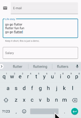
文本编辑
#Material 和 Cupertino 文本输入框都支持拼写检查,并能够根据平台调整使用合适的拼写检查配置,以及合适的拼写检查菜单和高亮色。
Flutter 会根据当前平台来适配正确的文本编辑体验。
键盘手势导航
#Android 平台,在虚拟键盘空格键上可以通过左右轻扫来移动光标, Material 和 Cupertino 的文本输入框控件都支持该特性。
iOS 设备提供了 3D Touch 兼容,通过在虚拟键盘上使用长按并拖拽手势可以任意方向移动光标。 Material 和 Cupertino 都对这个功能提供了支持。
Android space key cursor move
iOS 3D Touch drag cursor move
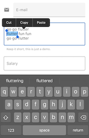
文本选中工具栏
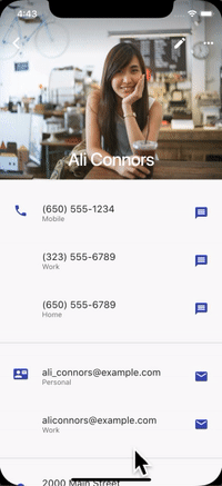
#在 Android 平台上使用 Material,在文本输入框里面选中文本会显示一个 Android 风格的文本选中工具栏。
在 iOS 平台上使用 Material 或者在两个平台上都使用 Cupertino,在文本输入框里面选中文本会展示一个 iOS 风格的文本选中工具栏。
Android text selection toolbar
iOS text selection toolbar
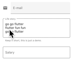
点击手势
#在 Android 平台使用 Material,在文本控件中点击会移动光标到点击处。
同时,光标会有一个可移动的把手,随后可以通过这个把手移动光标。
在 iOS 平台使用 Material 或者在两个平台都使用 Cupertino,在文本空间中点击,会把光标移动到点击处最近的单词末尾。
在 iOS 平台上,光标是没有把手的。
Android tap
iOS tap
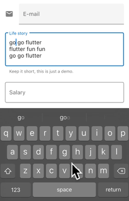
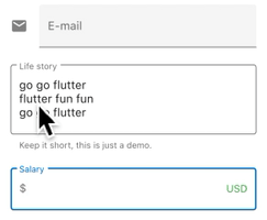
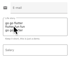
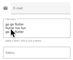
长按手势
#在 Android 平台使用 Material,在单词上长按会选中单词,并在释放长按的时候显示文本选中工具栏。
在 iOS 平台使用 Material 或者在两个平台都使用 Cupertino,长按会把光标放置到长按的位置,并在释放长按的时候显示文本选中工具栏。
Android long press
iOS long press
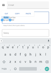
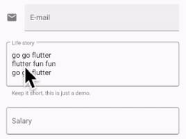
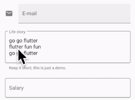
长按并拖放手势
#在 Android 平台上使用 Material,长按并拖拽会选中更多单词。
在 iOS 平台使用 Material 或者在两个平台都使用 Cupertino,长按并拖拽会移动光标。
Android long-press drag
iOS long-press drag
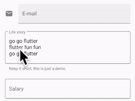
双击手势
#Android 和 iOS 平台上,双击选中一个单词都会收到双击手势事件,并显示文本选中工具栏。
Android double tap
iOS double tap
UI 组件
#本节包含有关如何调整 Material widget 以在 iOS 上提供自然且亮眼的体验的初步提议。欢迎你对问题 issue #8427 提出反馈。
带有 .adaptive() 构造的 widget
#
部分 widget 带有 .adaptive() 构造。下方的表列出了这些 widget。当应用程序在 iOS 设备上运行时,它们会自动以 Cupertino 的组件构造。
这些 widget 主要用于输入、选择和显示系统信息。由于它们与系统高度相关,用户可能已经习惯于与它们产生对应的记忆和反应。因此我们建议你在应用程序中采用各自平台的转化内容。
| Material widget | Cupertino widget | Adaptive constructor |
|---|---|---|
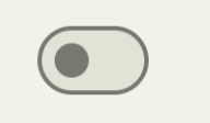
Switch
|

CupertinoSwitch
|
Switch.adaptive()
|

Slider
|

CupertinoSlider
|
Slider.adaptive()
|
CircularProgressIndicator
|

CupertinoActivityIndicator
|
CircularProgressIndicator.adaptive()
|
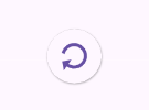
RefreshProgressIndicator
|

CupertinoActivityIndicator
|
RefreshIndicator.adaptive()
|

Checkbox
|

CupertinoCheckbox
|
Checkbox.adaptive()
|

Radio
|

CupertinoRadio
|
Radio.adaptive()
|
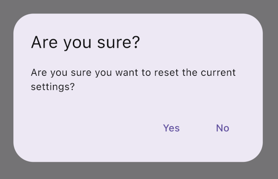
AlertDialog
|
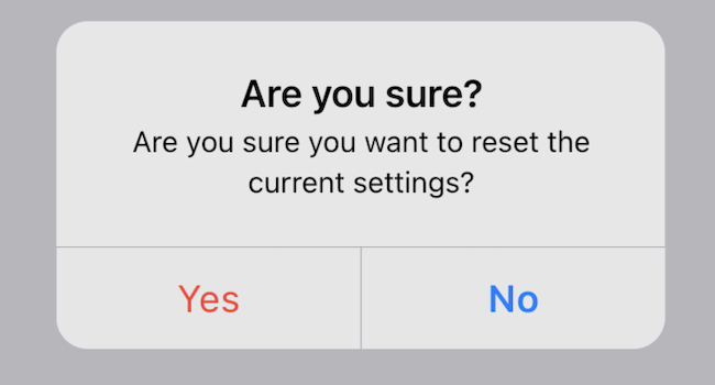
CupertinoAlertDialog
|
AlertDialog.adaptive()
|
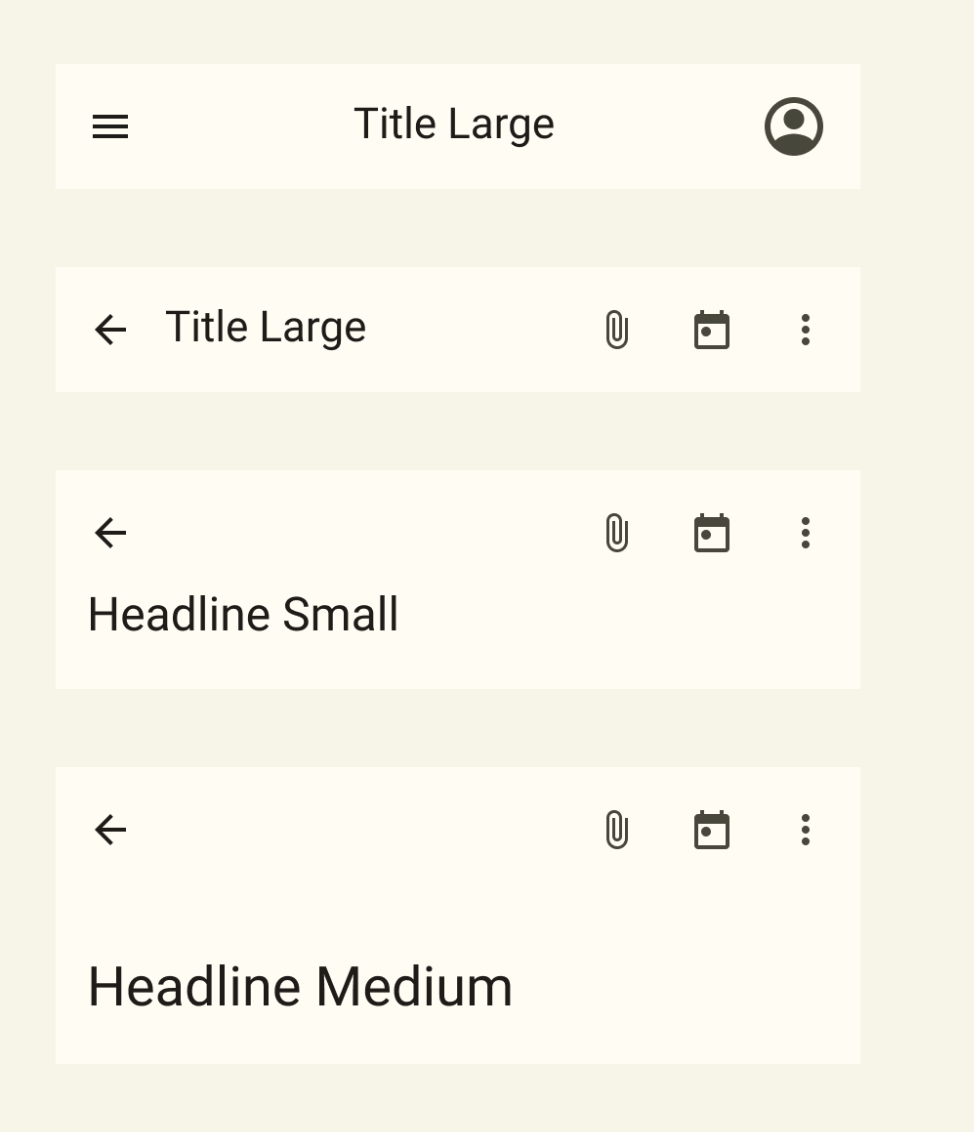
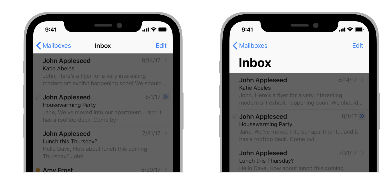
顶部应用栏和导航栏
#自 Android 12 起,顶部应用栏的界面遵循 Material 3 中定义的设计指南。在 iOS 上,Apple 的人机界面指南 (HIG) 中定义了一个名为「导航栏」的等效组件。
Top App Bar in Material 3
Navigation Bar in Human Interface Guidelines
Flutter 应用程序中应用栏的某些属性,例如系统图标和页面转场,都应该进行调整。使用 Material AppBar 和 SliverAppBar widget 时,这些属性都已经自动调整。你还可以进一步自定义它们的属性,以更好地匹配 iOS 的平台风格,如下所示。
// Map the text theme to iOS styles
TextTheme cupertinoTextTheme = TextTheme(
headlineMedium: CupertinoThemeData()
.textTheme
.navLargeTitleTextStyle
// fixes a small bug with spacing
.copyWith(letterSpacing: -1.5),
titleLarge: CupertinoThemeData().textTheme.navTitleTextStyle)
...
// Use iOS text theme on iOS devices
ThemeData(
textTheme: Platform.isIOS ? cupertinoTextTheme : null,
...
)
...
// Modify AppBar properties
AppBar(
surfaceTintColor: Platform.isIOS ? Colors.transparent : null,
shadowColor: Platform.isIOS ? CupertinoColors.darkBackgroundGray : null,
scrolledUnderElevation: Platform.isIOS ? .1 : null,
toolbarHeight: Platform.isIOS ? 44 : null,
...
),
但是,由于顶栏是与页面中的其他内容一起显示的,因此我们只建议调整样式,它只要能与应用程序的其余部分保持一致即可。你可以在 有关应用栏适配的 GitHub 讨论中 查看其他代码示例和进一步说明。
底部导航栏
#自 Android 12 起,底部导航栏的界面遵循 Material 3 中定义的设计指南。在 iOS 上,Apple 的人机界面指南 (HIG) 中定义了一个名为「标签页栏」的等效组件。
Bottom Navigation Bar in Material 3
Tab Bar in Human Interface Guidelines
由于标签栏在你的应用程序中是持续存在的,因此它们应该与你自己的品牌匹配。如果你选择在 Android 上使用 Material 的默认样式,你应该要在考虑在 iOS 平台上使用 iOS 的标签页栏。
如果你要实现特定于平台的底部导航栏,可以在 Android 上使用 Flutter 的 NavigationBar widget,在 iOS 上使用 CupertinoTabBar widget。下面是用于显示特定于平台的导航栏的代码片段。
final Map<String, Icon> _navigationItems = {
'Menu': Platform.isIOS ? Icon(CupertinoIcons.house_fill) : Icon(Icons.home),
'Order': Icon(Icons.adaptive.share),
};
...
Scaffold(
body: _currentWidget,
bottomNavigationBar: Platform.isIOS
? CupertinoTabBar(
currentIndex: _currentIndex,
onTap: (index) {
setState(() => _currentIndex = index);
_loadScreen();
},
items: _navigationItems.entries
.map<BottomNavigationBarItem>(
(entry) => BottomNavigationBarItem(
icon: entry.value,
label: entry.key,
))
.toList(),
)
: NavigationBar(
selectedIndex: _currentIndex,
onDestinationSelected: (index) {
setState(() => _currentIndex = index);
_loadScreen();
},
destinations: _navigationItems.entries
.map<Widget>((entry) => NavigationDestination(
icon: entry.value,
label: entry.key,
))
.toList(),
));
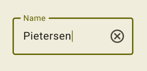
文本输入
#自 Android 12 起,文本输入组件的界面遵循 Material 3 中定义的设计指南。在 iOS 上,Apple 的人机界面指南 (HIG) 中定义了一个名为「文本栏」的等效组件。
Text Field in Material 3
Text Field in HIG
由于用户需要用文本栏来输入,因此它们应该遵循平台习惯来展示。
你可以调整 Material 材质的 TextField 的样式来实现对应平台的 TextField。
Widget _createAdaptiveTextField() {
final _border = OutlineInputBorder(
borderSide: BorderSide(color: CupertinoColors.lightBackgroundGray),
);
final iOSDecoration = InputDecoration(
border: _border,
enabledBorder: _border,
focusedBorder: _border,
filled: true,
fillColor: CupertinoColors.white,
hoverColor: CupertinoColors.white,
contentPadding: EdgeInsets.fromLTRB(10, 0, 0, 0),
);
return Platform.isIOS
? SizedBox(
height: 36.0,
child: TextField(
decoration: iOSDecoration,
),
)
: TextField();
}
若你想要了解有关调整文本字段的更多信息,请查看 有关文本字段的 GitHub 讨论。你可以在讨论中留下反馈或提出问题。
除非另有说明,本文档之所提及适用于 Flutter 3.44.0 版本。本页面最后更新时间:2026-06-22。查看文档源码 或者 为本页面内容提出建议。