Cupertino widgets
A catalog of Flutter's cupertino widgets. Beautiful and high-fidelity widgets that align with Apple's Human Interface Guidelines for iOS and macOS.
Beautiful and high-fidelity widgets that align with Apple's Human Interface Guidelines for iOS and macOS.
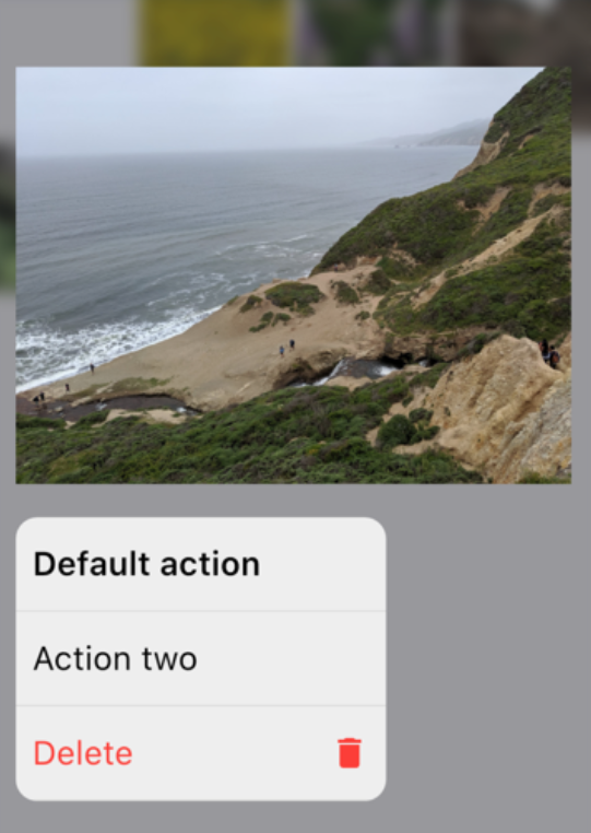
An iOS-style modal bottom action sheet to choose an option among many.
A button typically used in a CupertinoActionSheet.

An iOS-style activity indicator. Displays a circular 'spinner'.
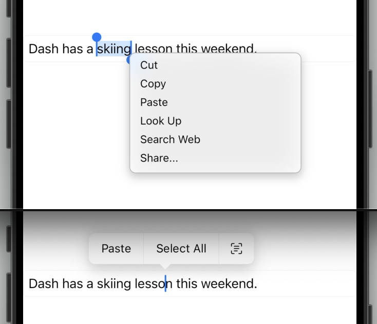
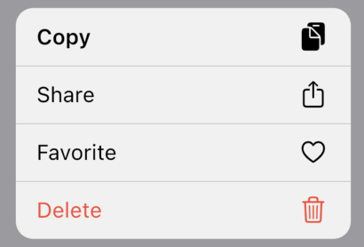
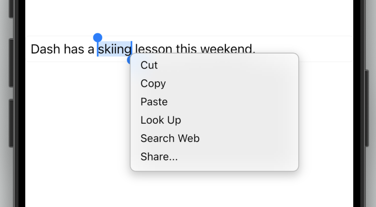
The default Cupertino context menu for text selection for the current platform with the given children.
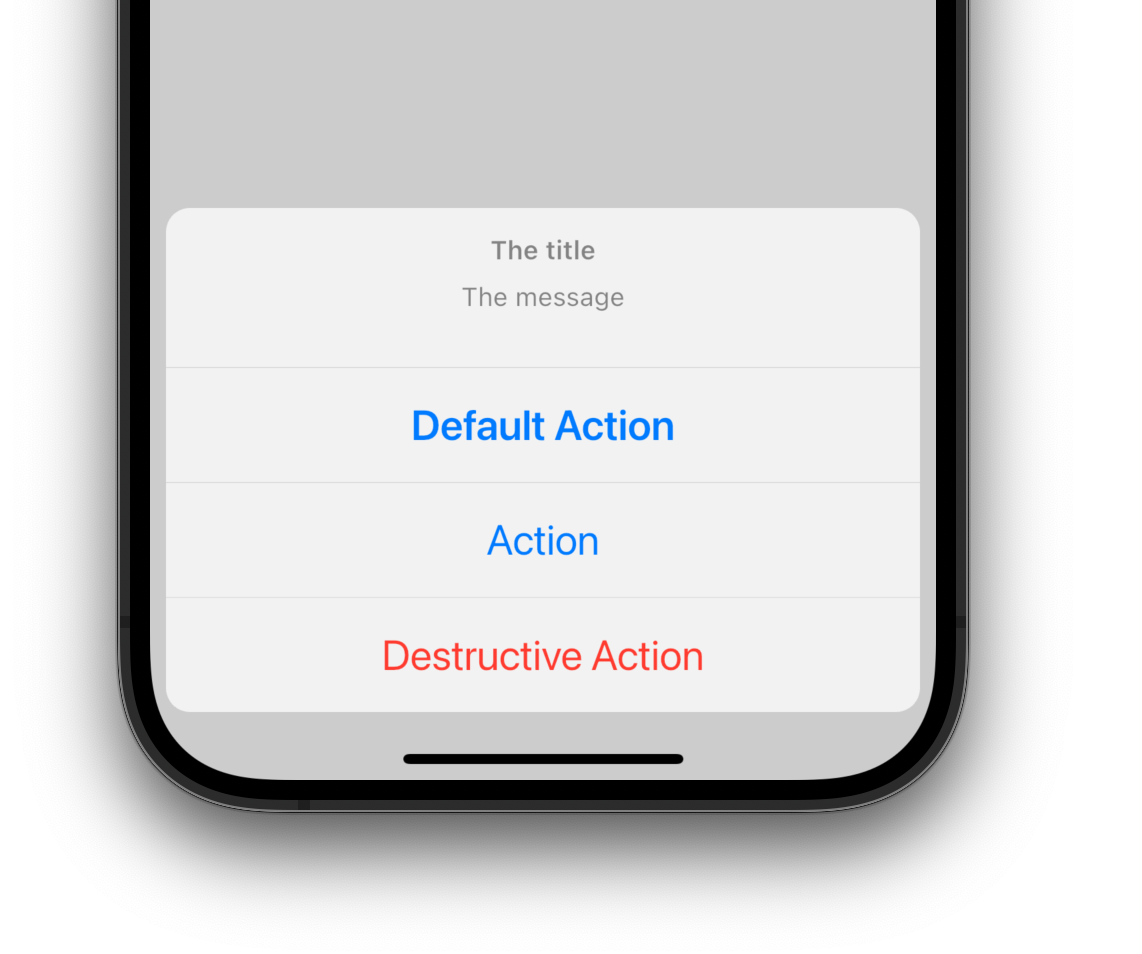
An iOS-style alert dialog.
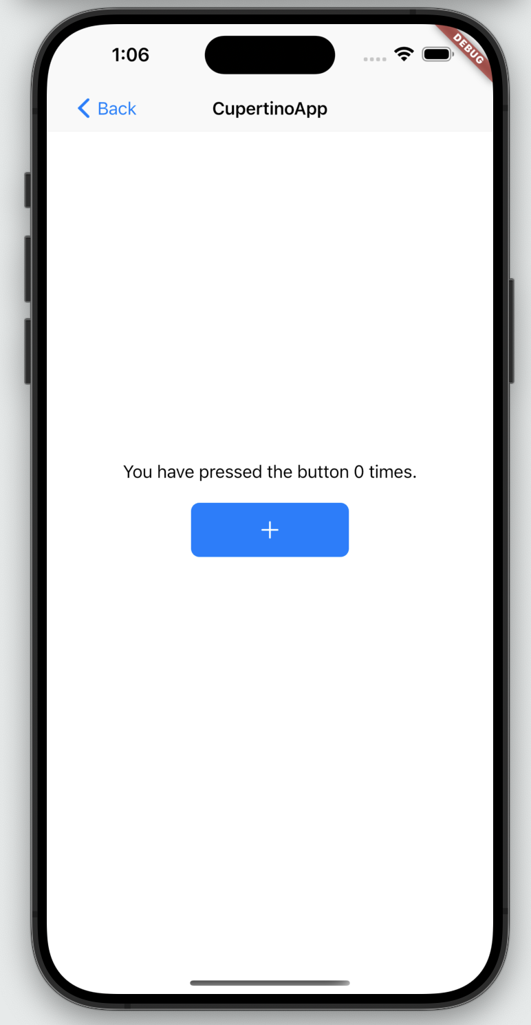
An application that uses Cupertino design.
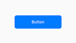
An iOS-style button.
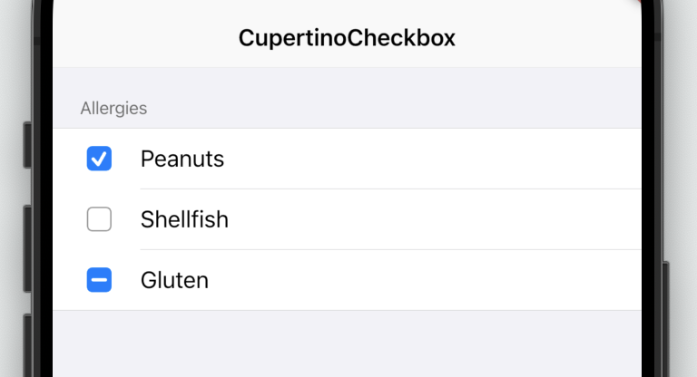
A macOS-style checkbox.
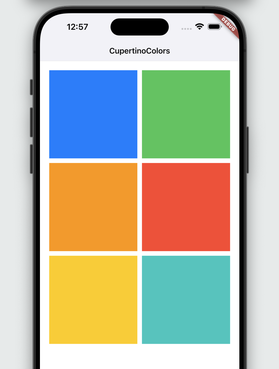
A palette of Color constants that describe colors commonly used when matching the iOS platform aesthetics.
An iOS-style full-screen modal route that opens when the child is long-pressed. Used to display relevant actions for your content.
A button in a ContextMenuSheet.
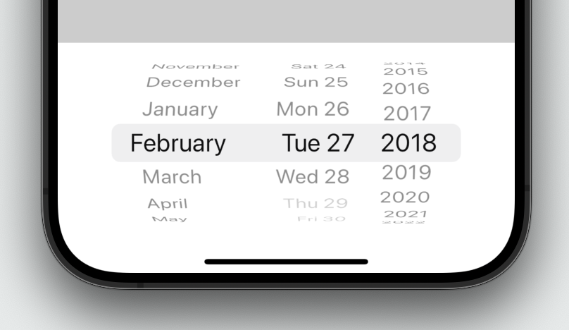
An iOS-style date or date and time picker.

Desktop Cupertino styled text selection controls.
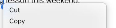
A macOS-style text selection toolbar.
A button in the style of the macOS context menu buttons.
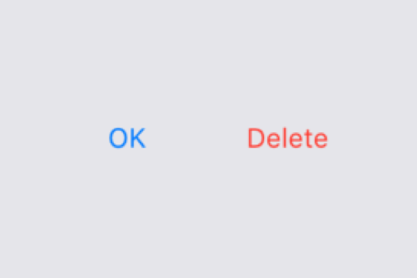
A button typically used in a CupertinoAlertDialog.
A dialog route that shows an iOS-style dialog.
A Color subclass that represents a family of colors, and the correct effective color in the color family.
An iOS-style form row.
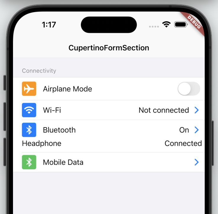
An iOS-style form section.
An iOS-style transition used for summoning fullscreen dialogs.
Styling specifications for a CupertinoTheme.
Container that uses the iOS style to display a scrollable view.
A block that uses the iOS style to create a row in a list.
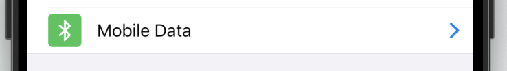
A typical iOS trailing widget used to denote that a CupertinoListTile is a button with an action.
Defines the localized resource values used by the Cupertino widgets.
A RawMagnifier used for magnifying text in cases where a user's finger may be blocking the point of interest, like a selection handle.
A route that shows a modal iOS-style popup that slides up from the bottom of the screen.
Container at the top of a screen that uses the iOS style. Many developers use this with CupertinoPageScaffold.

A nav bar back button typically used in CupertinoNavigationBar.
A page that creates a cupertino style PageRoute.
A modal route that replaces the entire screen with an iOS transition.
Basic iOS style page layout structure. Positions a navigation bar and content on a background.
Provides an iOS-style page transition animation.
An iOS-style picker control. Used to select an item in a short list.
A default selection overlay for CupertinoPickers.
Rounded rectangle surface that looks like an iOS popup surface, such as an alert dialog or action sheet.
A macOS-style radio button.
An iOS-style scrollbar that indicates which portion of a scrollable widget is currently visible.
Describes how Scrollable widgets behave for CupertinoApps.

An iOS-style search field.
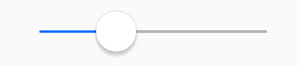
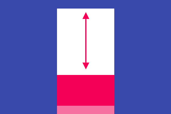
Used to select from a range of values.
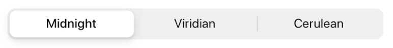
An iOS-13-style segmented control. Used to select mutually exclusive options in a horizontal list.
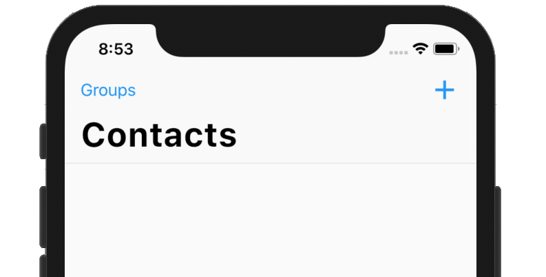
A navigation bar with iOS-11-style large titles using slivers.
A sliver widget implementing the iOS-style pull to refresh content control.
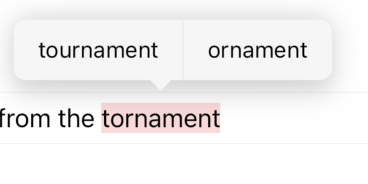
The default spell check suggestions toolbar for iOS.
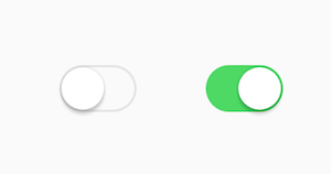
An iOS-style switch. Used to toggle the on/off state of a single setting.
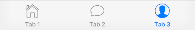
An iOS-style bottom tab bar. Typically used with CupertinoTabScaffold.
Coordinates tab selection between a CupertinoTabBar and a CupertinoTabScaffold.
Tabbed iOS app structure. Positions a tab bar on top of tabs of content.
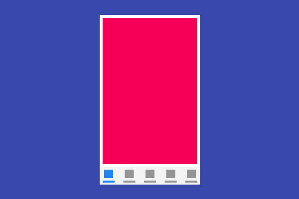
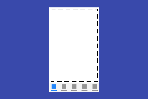
Root content of a tab that supports parallel navigation between tabs. Typically used with CupertinoTabScaffold.
An iOS-style text field.
Creates a CupertinoFormRow containing a FormField that wraps a CupertinoTextField.
A CupertinoMagnifier used for magnifying text in cases where a user's finger may be blocking the point of interest, like a selection handle.
iOS-style text selection controls.
An iOS-style text selection toolbar.
A button in the style of the iOS text selection toolbar buttons.
Cupertino typography theme in a CupertinoThemeData.
Applies a visual styling theme to descendant Cupertino widgets.
Paints an iOS-style slider thumb or switch thumb.
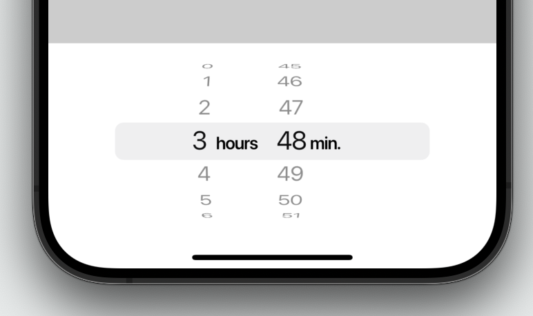
An iOS-style countdown timer picker.
更多 widget 请查看 widget 目录。
除非另有说明,本文档之所提及适用于 Flutter 3.44.0 版本。为本页面内容提出建议。