Layout widgets
A catalog of Flutter's layout widgets. Arrange other widgets columns, rows, grids, and many other layouts.
Arrange other widgets columns, rows, grids, and many other layouts.
Single-child layout widgets
A widget that aligns its child within itself and optionally sizes itself based on the child's size.
A widget that attempts to size the child to a specific aspect ratio.
Container that positions its child according to the child's baseline.
Alignment block that centers its child within itself.
A widget that imposes additional constraints on its child.
A convenience widget that combines common painting, positioning, and sizing widgets.
A widget that defers the layout of its single child to a delegate.
A widget that expands a child of a Row, Column, or Flex.
Scales and positions its child within itself according to fit.
A widget that sizes its child to a fraction of the total available space. For more details about the layout algorithm, see RenderFractionallySizedOverflowBox.
A widget that sizes its child to the child's intrinsic height.
A widget that sizes its child to the child's intrinsic width.
A box that limits its size only when it's unconstrained.
A widget that lays the child out as if it was in the tree, but without painting anything, without making the child available for hit...
A widget that imposes different constraints on its child than it gets from its parent, possibly allowing the child to overflow the parent.
A widget that insets its child by the given padding.
A box with a specified size. If given a child, this widget forces its child to have a specific width and/or height (assuming values are...
A widget that is a specific size but passes its original constraints through to its child, which will probably overflow.
A widget that applies a transformation before painting its child.
Multi-child layout widgets
Layout a list of child widgets in the vertical direction.
A widget that uses a delegate to size and position multiple children.

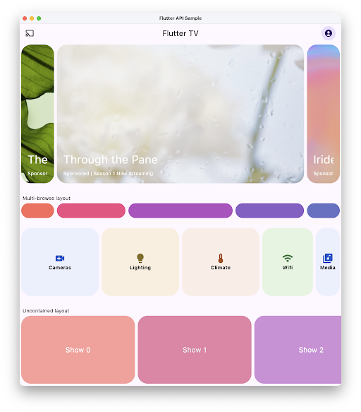
A Material carousel widget that presents a scrollable list of items, each of which can dynamically change size based on the chosen layout.
A widget that implements the flow layout algorithm.

A grid list consists of a repeated pattern of cells arrayed in a vertical and horizontal layout. The GridView widget implements this component.
A Stack that shows a single child from a list of children.
Builds a widget tree that can depend on the parent widget's size.
A widget that arranges its children sequentially along a given axis, forcing them to the dimension of the parent in the other axis.

A scrollable, linear list of widgets. ListView is the most commonly used scrolling widget. It displays its children one after another in the scroll direction....
Layout a list of child widgets in the horizontal direction.
This class is useful if you want to overlap several children in a simple way, for example having some text and an image, overlaid with...
Displays child widgets in rows and columns.
A widget that displays its children in multiple horizontal or vertical runs.
Sliver widgets

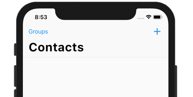
A navigation bar with iOS-11-style large titles using slivers.
A sliver widget implementing the iOS-style pull to refresh content control.
A ScrollView that creates custom scroll effects using slivers.

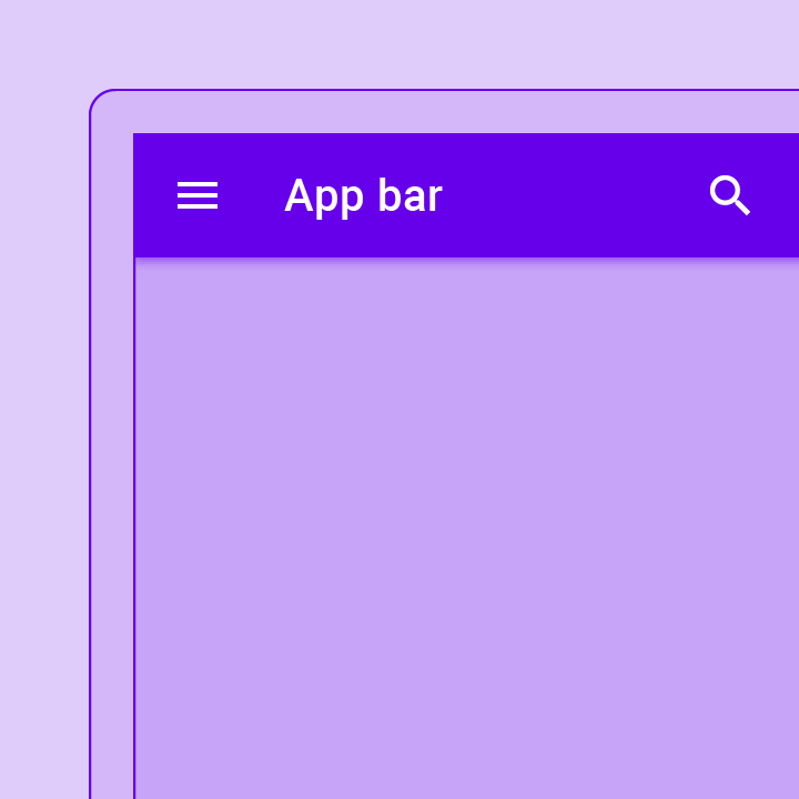
A material design app bar that integrates with a CustomScrollView.
A delegate that supplies children for slivers using a builder callback.
A delegate that supplies children for slivers using an explicit list.
A sliver that contains a single box child that fills the remaining space in the viewport.
A sliver that places multiple box children with the same main axis extent in a linear array.
A sliver that places multiple box children in a two dimensional arrangement.
A sliver that places multiple box children in a linear array along the main axis.
A sliver that applies padding on each side of another sliver.
A sliver whose size varies when the sliver is scrolled to the edge of the viewport opposite the sliver's GrowthDirection.
A sliver that contains a single box widget.
更多 widget 请查看 widget 目录。
除非另有说明,本文档之所提及适用于 Flutter 3.41.5 版本。为本页面内容提出建议。
