General approach to adaptive apps
General advice on how to approach making your Flutter app adaptive.
So, just how do you approach taking an app designed for conventional mobile devices, and make it beautiful on a wide range of devices? What steps are required?
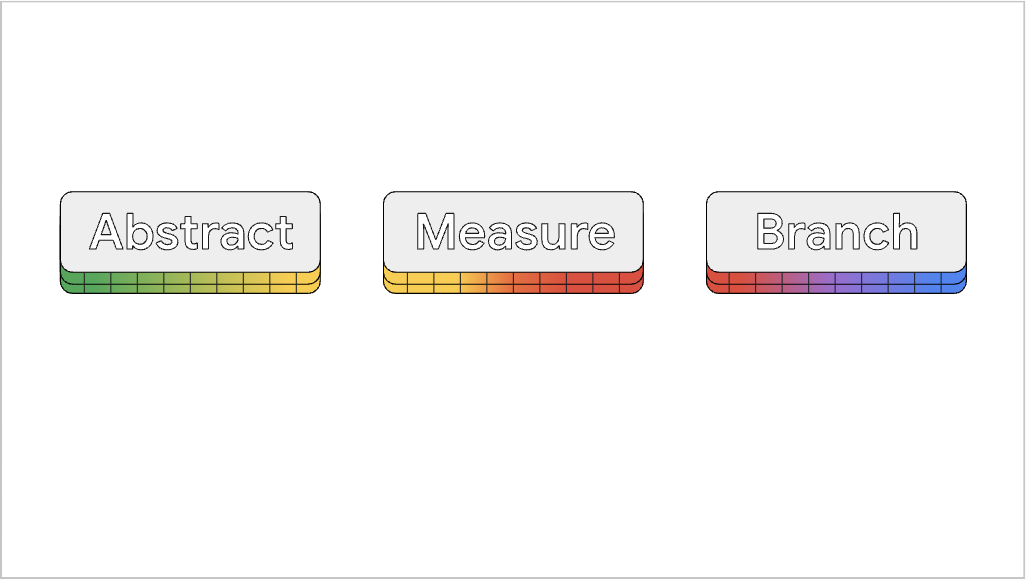
Google engineers, who have experience doing this very thing for large apps, recommend the following 3-step approach.
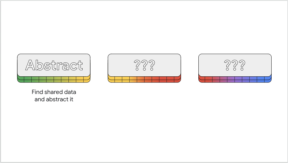
Step 1: Abstract
#

First, identify the widgets that you plan to make dynamic. Analyze the constructors for those widgets and abstract out the data that you can share.
Common widgets that require adaptability are:
- Dialogs, both fullscreen and modal
- Navigation UI, both rail and bottom bar
- Custom layout, such as "is the UI area taller or wider?"
For example, in a Dialog widget, you can share
the info that contains the content of the dialog.
Or, perhaps you want to switch between a
NavigationBar when the app window is small,
and a NavigationRail when the app window is large.
These widgets would likely share a list of
navigable destinations. In this case,
you might create a Destination widget to hold
this info, and specify the Destination as having both
an icon and a text label.
Next, you will evaluate your screen size to decide on how to display your UI.
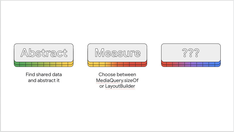
Step 2: Measure
#

You have two ways to determine the size of your display area:
MediaQuery and LayoutBuilder.
MediaQuery
#
In the past, you might have used MediaQuery.of to
determine the size of the device's screen.
However, devices today feature screens
with a wide variety of sizes and shapes,
and this test can be misleading.
For example, maybe your app currently occupies a
small window on a large screen. If you use the
MediaQuery.of method and conclude the screen to be small
(when, in fact, the app displays in a tiny window on a large screen),
and you've portrait locked your app, it causes the
app's window to lock to the center of the
screen, surrounded with black.
This is hardly an ideal UI on a large screen.
Keep in mind that MediaQuery.sizeOf returns the
current size of the app's entire screen and
not just a single widget.
You have two ways to measure your screen space.
You can use either MediaQuery.sizeOf or LayoutBuilder,
depending on whether you want the size of the whole
app window, or more local sizing.
If you want your widget to be fullscreen,
even when the app window is small,
use MediaQuery.sizeOf so you can choose the
UI based on the size of the app window itself.
In the previous section, you want to base the
sizing behavior on the entire app's window,
so you would use MediaQuery.sizeOf.
Requesting the size of the app window from inside
the build method, as in MediaQuery.sizeOf(context),
causes the given BuildContext to rebuild any time
the size property changes.
LayoutBuilder
#
LayoutBuilder accomplishes a similar goal as
MediaQuery.sizeOf, with some distinctions.
Rather than providing the size of the app's window,
LayoutBuilder provides the layout constraints from
the parent Widget. This means that you get
sizing information based on the specific spot
in the widget tree where you added the LayoutBuilder.
Also, LayoutBuilder returns a BoxConstraints
object instead of a Size object,
so you are given the valid width
and height ranges (minimum and maximum) for the content,
rather than just a fixed size.
This can be useful for custom widgets.
For example, imagine a custom widget, where you want
the sizing to be based on the space specifically
given to that widget, and not the app window in general.
In this scenario, use LayoutBuilder.
Step 3: Branch
#

At this point, you must decide what sizing breakpoints to use when choosing what version of the UI to display. For example, the Material layout guidelines suggest using a bottom nav bar for windows less than 600 logical pixels wide, and a nav rail for those that are 600 pixels wide or greater. Again, your choice shouldn't depend on the type of device, but on the device's available window size.
To work through an example that switches between a
NavigationRail and a NavigationBar, check out
the Building an animated responsive app layout with Material 3.
The next page discusses how to ensure that your app looks best on large screens and foldables.
除非另有说明,本文档之所提及适用于 Flutter 3.41.5 版本。本页面最后更新时间:2025-10-30。查看文档源码 或者 为本页面内容提出建议。