List with spaced items
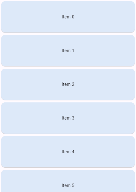
Perhaps you want to create a list where all list items are spaced evenly, so that the items take up the visible space. For example, the four items in the following image are spaced evenly, with "Item 0" at the top, and "Item 3" at the bottom.

At the same time, you might want to allow users to scroll through the list when the list of items won't fit, maybe because a device is too small, a user resized a window, or the number of items exceeds the screen size.

Typically, you use Spacer to tune the spacing between widgets,
or Expanded to expand a widget to fill the available space.
However, these solutions are not possible inside scrollable widgets,
because they need a finite height constraint.
This recipe demonstrates how to use LayoutBuilder and ConstrainedBox
to space out list items evenly when there is enough space, and to allow
users to scroll when there is not enough space,
using the following steps:
- Add a
LayoutBuilderwith aSingleChildScrollView. - Add a
ConstrainedBoxinside theSingleChildScrollView. - Create a
Columnwith spaced items.
1. Add a LayoutBuilder with a SingleChildScrollView
#Start by creating a LayoutBuilder. You need to provide
a builder callback function with two parameters:
- The
BuildContextprovided by theLayoutBuilder. - The
BoxConstraintsof the parent widget.
In this recipe, you won't be using the BuildContext,
but you will need the BoxConstraints in the next step.
Inside the builder function, return a SingleChildScrollView.
This widget ensures that the child widget can be scrolled,
even when the parent container is too small.
LayoutBuilder(
  builder: (context, constraints) {
    return SingleChildScrollView(child: Placeholder());
  },
);
2. Add a ConstrainedBox inside the SingleChildScrollView
#In this step, add a ConstrainedBox
as the child of the SingleChildScrollView.
The ConstrainedBox widget imposes additional constraints to its child.
Configure the constraint by setting the minHeight parameter to be
the maxHeight of the LayoutBuilder constraints.
This ensures that the child widget
is constrained to have a minimum height equal to the available
space provided by the LayoutBuilder constraints,
namely the maximum height of the BoxConstraints.
LayoutBuilder(
  builder: (context, constraints) {
    return SingleChildScrollView(
      child: ConstrainedBox(
        constraints: BoxConstraints(minHeight: constraints.maxHeight),
        child: Placeholder(),
      ),
    );
  },
);
However, you don't set the maxHeight parameter,
because you need to allow the child to be larger
than the LayoutBuilder size,
in case the items don't fit the screen.
3. Create a Column with spaced items
#Finally, add a Column as the child of the ConstrainedBox.
To space the items evenly,
set the mainAxisAlignment to MainAxisAlignment.spaceBetween.
LayoutBuilder(
  builder: (context, constraints) {
    return SingleChildScrollView(
      child: ConstrainedBox(
        constraints: BoxConstraints(minHeight: constraints.maxHeight),
        child: Column(
          mainAxisAlignment: MainAxisAlignment.spaceBetween,
          children: [
            ItemWidget(text: 'Item 1'),
            ItemWidget(text: 'Item 2'),
            ItemWidget(text: 'Item 3'),
          ],
        ),
      ),
    );
  },
);
Alternatively, you can use the Spacer widget
to tune the spacing between the items,
or the Expanded widget, if you want one widget to take more space than others.
For that, you have to wrap the Column with an IntrinsicHeight widget,
which forces the Column widget to size itself to a minimum height,
instead of expanding infinitely.
LayoutBuilder(
  builder: (context, constraints) {
    return SingleChildScrollView(
      child: ConstrainedBox(
        constraints: BoxConstraints(minHeight: constraints.maxHeight),
        child: IntrinsicHeight(
          child: Column(
            children: [
              ItemWidget(text: 'Item 1'),
              Spacer(),
              ItemWidget(text: 'Item 2'),
              Expanded(child: ItemWidget(text: 'Item 3')),
            ],
          ),
        ),
      ),
    );
  },
);Interactive example
#This example shows a list of items that are spaced evenly within a column.
The list can be scrolled up and down when the items don't fit the screen.
The number of items is defined by the variable items,
change this value to see what happens when the items won't fit the screen.
import 'package:flutter/material.dart';

void main() => runApp(const SpacedItemsList());

class SpacedItemsList extends StatelessWidget {
  const SpacedItemsList({super.key});

  @override
  Widget build(BuildContext context) {
    const items = 4;

    return MaterialApp(
      title: 'Flutter Demo',
      debugShowCheckedModeBanner: false,
      theme: ThemeData(
        colorScheme: ColorScheme.fromSeed(seedColor: Colors.deepPurple),
        cardTheme: CardThemeData(color: Colors.blue.shade50),
      ),
      home: Scaffold(
        body: LayoutBuilder(
          builder: (context, constraints) {
            return SingleChildScrollView(
              child: ConstrainedBox(
                constraints: BoxConstraints(minHeight: constraints.maxHeight),
                child: Column(
                  mainAxisAlignment: MainAxisAlignment.spaceBetween,
                  crossAxisAlignment: CrossAxisAlignment.stretch,
                  children: List.generate(
                    items,
                    (index) => ItemWidget(text: 'Item $index'),
                  ),
                ),
              ),
            );
          },
        ),
      ),
    );
  }
}

class ItemWidget extends StatelessWidget {
  const ItemWidget({super.key, required this.text});

  final String text;

  @override
  Widget build(BuildContext context) {
    return Card(
      child: SizedBox(height: 100, child: Center(child: Text(text))),
    );
  }
}
除非另有说明,本文档之所提及适用于 Flutter 的最新稳定版本,本页面最后更新时间: 2025-05-19。 查看文档源码 或者 为本页面内容提出建议.