

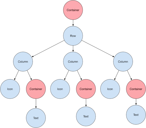
 Most of this should look as you might expect, but you might be wondering
about the containers (shown in pink). [`Container`][] is a widget class
that allows you to customize its child widget. Use a `Container` when
you want to add padding, margins, borders, or background color,
to name some of its capabilities.
图上大部分应该和你预想的一样,但你可能会疑惑 container(图上粉色显示的)是什么。
[`Container`][] 是一个 widget,让你自定义其子 widget。
举几个例子,如果要添加 padding、margin、边框或背景颜色,
你就可以用上 `Container` 了。
Each [`Text`][] widget is placed in a `Container`
to add margins. The entire [`Row`][] is also placed in a
`Container` to add padding around the row.
每个 [`Text`][] widget 都被放在一个 `Container` 以添加 margin。
整个 [`Row`][] 也被放在一个 `Container` 中,以便添加 padding。
The rest of the UI is controlled by properties.
Set an [`Icon`][]'s color using its `color` property.
Use the `Text.style` property to set the font, its color, weight, and so on.
Columns and rows have properties that allow you to specify how their
children are aligned vertically or horizontally, and how much space
the children should occupy.
UI 的其余部分由属性控制。通过 [`Icon`][] 的 `color` 属性来设置它的颜色,
通过 `Text.style` 属性来设置文字的字体、颜色、字重等等。
Column 和 Row 有一些属性可以让你指定子项垂直或水平的对齐方式以及子项应占用的空间大小。
:::note
Most of the screenshots in this tutorial are displayed with
`debugPaintSizeEnabled` set to `true` so you can see the
visual layout. For more information, see
[Debugging layout issues visually][].
本教程中的大部分截图都是在将 `debugPaintSizeEnabled` 设置为 `true` 时显示的,
因此你可以看到可视化布局。
相关详细信息,请参阅 [可视化地调试布局问题][Debugging layout issues visually]。
:::
[`Container`]: https://api.flutter-io.cn/flutter/widgets/Container-class.html
[Debugging layout issues visually]: /tools/devtools/inspector#debugging-layout-issues-visually
[`Icon`]: https://api.flutter-io.cn/flutter/material/Icons-class.html
[`Row`]: https://api.flutter-io.cn/flutter/widgets/Row-class.html
[`Text`]: https://api.flutter-io.cn/flutter/widgets/Text-class.html
## Lay out a widget
## 布局 widget
How do you lay out a single widget in Flutter? This section
shows you how to create and display a simple widget.
It also shows the entire code for a simple Hello World app.
如何在 Flutter 中布局单个 widget?本节将介绍如何创建和显示单个 widget。
本节还包括一个简单的 Hello World app 的完整代码。
In Flutter, it takes only a few steps to put text, an icon,
or an image on the screen.
在 Flutter 中,只需几步就可以在屏幕上显示文本、图标或图像。
### 1. Select a layout widget
### 1. 选择一个布局 widget
Choose from a variety of [layout widgets][] based
on how you want to align or constrain a visible widget,
as these characteristics are typically passed on to the
contained widget.
根据你想要对齐或限制可见 widget 的方式,从各种
[布局 widget][layout widgets] 中进行选择,
因为这些特性通常会传递给它所包含的 widget。
For example, you could use the
[`Center`][] layout widget to center a visible widget
horizontally and vertically:
例如,你可以使用 [`Center`][] 布局 widget 将可见的 widget
水平和垂直居中。
```dart
Center(
// Content to be centered here.
)
```
[`Center`]: https://api.flutter-io.cn/flutter/widgets/Center-class.html
[layout widgets]: /ui/widgets/layout
### 2. Create a visible widget
### 2. 创建一个可见 widget
Choose a [visible widget][] for your app to contain
visible elements, such as [text][], [images][], or
[icons][].
为你的应用程序选择 [可见的 widget][visible widget],
以包含可见元素,如 [text][]、[images][] 或 [icons][]。
For example, you could use the [`Text`][] widget display
some text:
例如,你可以使用 [`Text`][] widget 显示一些文本:
```dart
Text('Hello World')
```
[icons]: https://api.flutter-io.cn/flutter/material/Icons-class.html
[images]: https://api.flutter-io.cn/flutter/widgets/Image-class.html
[text]: https://api.flutter-io.cn/flutter/widgets/Text-class.html
[`Text`]: https://api.flutter-io.cn/flutter/widgets/Text-class.html
[visible widget]: /ui/widgets
### 3. Add the visible widget to the layout widget
### 3. 将可见 widget 添加到布局 widget
All layout widgets have either of the following:
所有布局 widget 都具有以下任一项:
* A `child` property if they take a single child—for example,
`Center` or `Container`
一个 `child` 属性,如果它们只包含一个子项 — 例如 `Center` 和 `Container`
* A `children` property if they take a list of widgets—for example,
`Row`, `Column`, `ListView`, or `Stack`.
一个 `children` 属性,如果它们包含多个子项 — 例如 `Row`、`Column`、`ListView` 和 `Stack`
Add the `Text` widget to the `Center` widget:
将 `Text` widget 添加进 `Center` widget:
```dart
const Center(
child: Text('Hello World'),
),
```
### 4. Add the layout widget to the page
### 4. 将布局 widget 添加到页面
A Flutter app is itself a widget, and most widgets have a [`build()`][]
method. Instantiating and returning a widget in the app's `build()` method
displays the widget.
一个 Flutter 应用本身就是一个 widget,
大多数 widget 都有一个 [`build()`][] 方法,
在应用的 `build()` 方法中实例化和返回一个 widget 会让它显示出来。
Most of this should look as you might expect, but you might be wondering
about the containers (shown in pink). [`Container`][] is a widget class
that allows you to customize its child widget. Use a `Container` when
you want to add padding, margins, borders, or background color,
to name some of its capabilities.
图上大部分应该和你预想的一样,但你可能会疑惑 container(图上粉色显示的)是什么。
[`Container`][] 是一个 widget,让你自定义其子 widget。
举几个例子,如果要添加 padding、margin、边框或背景颜色,
你就可以用上 `Container` 了。
Each [`Text`][] widget is placed in a `Container`
to add margins. The entire [`Row`][] is also placed in a
`Container` to add padding around the row.
每个 [`Text`][] widget 都被放在一个 `Container` 以添加 margin。
整个 [`Row`][] 也被放在一个 `Container` 中,以便添加 padding。
The rest of the UI is controlled by properties.
Set an [`Icon`][]'s color using its `color` property.
Use the `Text.style` property to set the font, its color, weight, and so on.
Columns and rows have properties that allow you to specify how their
children are aligned vertically or horizontally, and how much space
the children should occupy.
UI 的其余部分由属性控制。通过 [`Icon`][] 的 `color` 属性来设置它的颜色,
通过 `Text.style` 属性来设置文字的字体、颜色、字重等等。
Column 和 Row 有一些属性可以让你指定子项垂直或水平的对齐方式以及子项应占用的空间大小。
:::note
Most of the screenshots in this tutorial are displayed with
`debugPaintSizeEnabled` set to `true` so you can see the
visual layout. For more information, see
[Debugging layout issues visually][].
本教程中的大部分截图都是在将 `debugPaintSizeEnabled` 设置为 `true` 时显示的,
因此你可以看到可视化布局。
相关详细信息,请参阅 [可视化地调试布局问题][Debugging layout issues visually]。
:::
[`Container`]: https://api.flutter-io.cn/flutter/widgets/Container-class.html
[Debugging layout issues visually]: /tools/devtools/inspector#debugging-layout-issues-visually
[`Icon`]: https://api.flutter-io.cn/flutter/material/Icons-class.html
[`Row`]: https://api.flutter-io.cn/flutter/widgets/Row-class.html
[`Text`]: https://api.flutter-io.cn/flutter/widgets/Text-class.html
## Lay out a widget
## 布局 widget
How do you lay out a single widget in Flutter? This section
shows you how to create and display a simple widget.
It also shows the entire code for a simple Hello World app.
如何在 Flutter 中布局单个 widget?本节将介绍如何创建和显示单个 widget。
本节还包括一个简单的 Hello World app 的完整代码。
In Flutter, it takes only a few steps to put text, an icon,
or an image on the screen.
在 Flutter 中,只需几步就可以在屏幕上显示文本、图标或图像。
### 1. Select a layout widget
### 1. 选择一个布局 widget
Choose from a variety of [layout widgets][] based
on how you want to align or constrain a visible widget,
as these characteristics are typically passed on to the
contained widget.
根据你想要对齐或限制可见 widget 的方式,从各种
[布局 widget][layout widgets] 中进行选择,
因为这些特性通常会传递给它所包含的 widget。
For example, you could use the
[`Center`][] layout widget to center a visible widget
horizontally and vertically:
例如,你可以使用 [`Center`][] 布局 widget 将可见的 widget
水平和垂直居中。
```dart
Center(
// Content to be centered here.
)
```
[`Center`]: https://api.flutter-io.cn/flutter/widgets/Center-class.html
[layout widgets]: /ui/widgets/layout
### 2. Create a visible widget
### 2. 创建一个可见 widget
Choose a [visible widget][] for your app to contain
visible elements, such as [text][], [images][], or
[icons][].
为你的应用程序选择 [可见的 widget][visible widget],
以包含可见元素,如 [text][]、[images][] 或 [icons][]。
For example, you could use the [`Text`][] widget display
some text:
例如,你可以使用 [`Text`][] widget 显示一些文本:
```dart
Text('Hello World')
```
[icons]: https://api.flutter-io.cn/flutter/material/Icons-class.html
[images]: https://api.flutter-io.cn/flutter/widgets/Image-class.html
[text]: https://api.flutter-io.cn/flutter/widgets/Text-class.html
[`Text`]: https://api.flutter-io.cn/flutter/widgets/Text-class.html
[visible widget]: /ui/widgets
### 3. Add the visible widget to the layout widget
### 3. 将可见 widget 添加到布局 widget
All layout widgets have either of the following:
所有布局 widget 都具有以下任一项:
* A `child` property if they take a single child—for example,
`Center` or `Container`
一个 `child` 属性,如果它们只包含一个子项 — 例如 `Center` 和 `Container`
* A `children` property if they take a list of widgets—for example,
`Row`, `Column`, `ListView`, or `Stack`.
一个 `children` 属性,如果它们包含多个子项 — 例如 `Row`、`Column`、`ListView` 和 `Stack`
Add the `Text` widget to the `Center` widget:
将 `Text` widget 添加进 `Center` widget:
```dart
const Center(
child: Text('Hello World'),
),
```
### 4. Add the layout widget to the page
### 4. 将布局 widget 添加到页面
A Flutter app is itself a widget, and most widgets have a [`build()`][]
method. Instantiating and returning a widget in the app's `build()` method
displays the widget.
一个 Flutter 应用本身就是一个 widget,
大多数 widget 都有一个 [`build()`][] 方法,
在应用的 `build()` 方法中实例化和返回一个 widget 会让它显示出来。
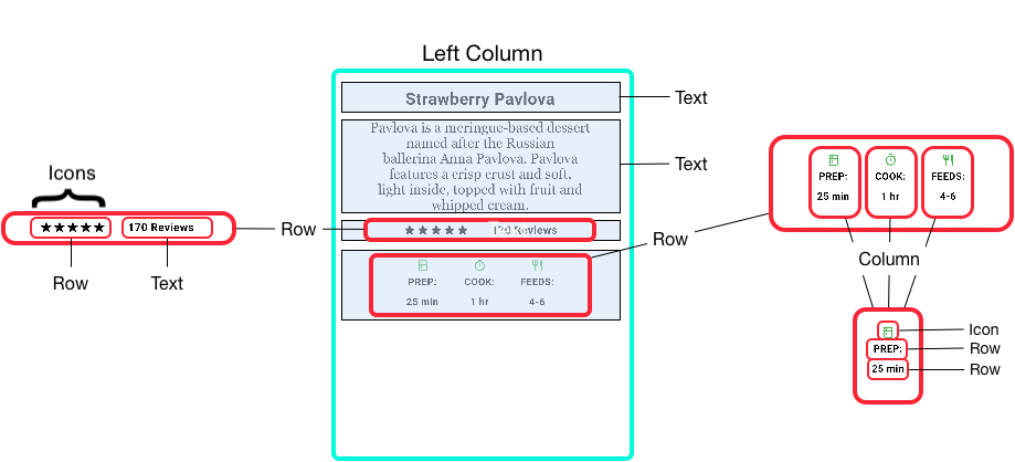
 The left column's widget tree nests rows and columns.
左侧列的 widget 树嵌套着行和列。
The left column's widget tree nests rows and columns.
左侧列的 widget 树嵌套着行和列。
 You'll implement some of Pavlova's layout code in
[Nesting rows and columns](#nesting-rows-and-columns).
你将在 [嵌套行和列](#nesting-rows-and-columns) 中实现蛋糕介绍示例的一些布局代码。
:::note
`Row` and `Column` are basic primitive widgets for horizontal
and vertical layouts—these low-level widgets allow for maximum
customization. Flutter also offers specialized, higher-level widgets
that might be sufficient for your needs. For example,
instead of `Row` you might prefer [`ListTile`][],
an easy-to-use widget with properties for leading and trailing icons,
and up to 3 lines of text. Instead of Column, you might prefer
[`ListView`][], a column-like layout that automatically scrolls
if its content is too long to fit the available space.
For more information, see [Common layout widgets][].
Row 和 Column 是水平和垂直布局的基本原始 widget — 这些低级 widget 允许最大程度的自定义。
Flutter 还提供专门的、更高级别的 widget,可能可以直接满足需求。
例如,和 Row 相比你可能更喜欢 [`ListTile`][],
这是一个易于使用的 widget,有属性可以设置头尾图标,最多可以显示 3 行文本;
和 Column 相比你也可能更喜欢 [`ListView`][],
这是一种类似于列的布局,但如果其内容太长导致可用空间不够容纳时会自动滚动。
更多信息可以查看 [通用布局 widget][Common layout widgets]。
:::
[Common layout widgets]: #common-layout-widgets
[`Column`]: https://api.flutter-io.cn/flutter/widgets/Column-class.html
[`ListTile`]: https://api.flutter-io.cn/flutter/material/ListTile-class.html
[`ListView`]: https://api.flutter-io.cn/flutter/widgets/ListView-class.html
[`Row`]: https://api.flutter-io.cn/flutter/widgets/Row-class.html
### Aligning widgets
### 对齐 widget
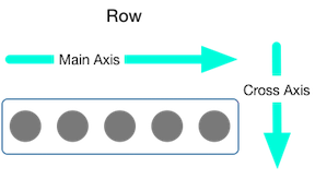
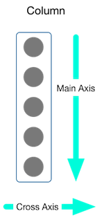
You control how a row or column aligns its children using the
`mainAxisAlignment` and `crossAxisAlignment` properties.
For a row, the main axis runs horizontally and the cross axis runs
vertically. For a column, the main axis runs vertically and the cross
axis runs horizontally.
你可以使用 `mainAxisAlignment` 和 `crossAxisAlignment`
属性控制行或列如何对齐其子项。
对于一行来说,主轴水平延伸,交叉轴垂直延伸。
对于一列来说,主轴垂直延伸,交叉轴水平延伸。
You'll implement some of Pavlova's layout code in
[Nesting rows and columns](#nesting-rows-and-columns).
你将在 [嵌套行和列](#nesting-rows-and-columns) 中实现蛋糕介绍示例的一些布局代码。
:::note
`Row` and `Column` are basic primitive widgets for horizontal
and vertical layouts—these low-level widgets allow for maximum
customization. Flutter also offers specialized, higher-level widgets
that might be sufficient for your needs. For example,
instead of `Row` you might prefer [`ListTile`][],
an easy-to-use widget with properties for leading and trailing icons,
and up to 3 lines of text. Instead of Column, you might prefer
[`ListView`][], a column-like layout that automatically scrolls
if its content is too long to fit the available space.
For more information, see [Common layout widgets][].
Row 和 Column 是水平和垂直布局的基本原始 widget — 这些低级 widget 允许最大程度的自定义。
Flutter 还提供专门的、更高级别的 widget,可能可以直接满足需求。
例如,和 Row 相比你可能更喜欢 [`ListTile`][],
这是一个易于使用的 widget,有属性可以设置头尾图标,最多可以显示 3 行文本;
和 Column 相比你也可能更喜欢 [`ListView`][],
这是一种类似于列的布局,但如果其内容太长导致可用空间不够容纳时会自动滚动。
更多信息可以查看 [通用布局 widget][Common layout widgets]。
:::
[Common layout widgets]: #common-layout-widgets
[`Column`]: https://api.flutter-io.cn/flutter/widgets/Column-class.html
[`ListTile`]: https://api.flutter-io.cn/flutter/material/ListTile-class.html
[`ListView`]: https://api.flutter-io.cn/flutter/widgets/ListView-class.html
[`Row`]: https://api.flutter-io.cn/flutter/widgets/Row-class.html
### Aligning widgets
### 对齐 widget
You control how a row or column aligns its children using the
`mainAxisAlignment` and `crossAxisAlignment` properties.
For a row, the main axis runs horizontally and the cross axis runs
vertically. For a column, the main axis runs vertically and the cross
axis runs horizontally.
你可以使用 `mainAxisAlignment` 和 `crossAxisAlignment`
属性控制行或列如何对齐其子项。
对于一行来说,主轴水平延伸,交叉轴垂直延伸。
对于一列来说,主轴垂直延伸,交叉轴水平延伸。
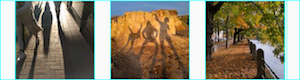 **App source:** [row_column](https://github.com/cfug/flutter.cn/tree/main/examples/layout/row_column)
**App 源码:**[row_column](https://github.com/cfug/flutter.cn/tree/main/examples/layout/row_column)
**App source:** [row_column](https://github.com/cfug/flutter.cn/tree/main/examples/layout/row_column)
**App 源码:**[row_column](https://github.com/cfug/flutter.cn/tree/main/examples/layout/row_column)
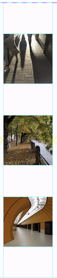 **App source:** [row_column](https://github.com/cfug/flutter.cn/tree/main/examples/layout/row_column)
**App 源码:**[row_column](https://github.com/cfug/flutter.cn/tree/main/examples/layout/row_column)
**App source:** [row_column](https://github.com/cfug/flutter.cn/tree/main/examples/layout/row_column)
**App 源码:**[row_column](https://github.com/cfug/flutter.cn/tree/main/examples/layout/row_column)
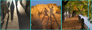
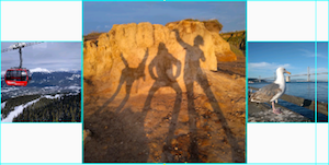
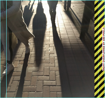 Widgets can be sized to fit within a row or column by using the
[`Expanded`][] widget. To fix the previous example where the
row of images is too wide for its render box,
wrap each image with an `Expanded` widget.
通过使用 [`Expanded`][] widget,可以调整 widget 的大小以适合行或列。
要修复上一个图像行对其渲染框来说太宽的示例,
可以用 `Expanded` widget 把每个图像包起来。
Widgets can be sized to fit within a row or column by using the
[`Expanded`][] widget. To fix the previous example where the
row of images is too wide for its render box,
wrap each image with an `Expanded` widget.
通过使用 [`Expanded`][] widget,可以调整 widget 的大小以适合行或列。
要修复上一个图像行对其渲染框来说太宽的示例,
可以用 `Expanded` widget 把每个图像包起来。
 **App source:** [sizing](https://github.com/cfug/flutter.cn/tree/main/examples/layout/sizing)
**App 源码:**[sizing](https://github.com/cfug/flutter.cn/tree/main/examples/layout/sizing)
**App source:** [sizing](https://github.com/cfug/flutter.cn/tree/main/examples/layout/sizing)
**App 源码:**[sizing](https://github.com/cfug/flutter.cn/tree/main/examples/layout/sizing)
 **App source:** [sizing](https://github.com/cfug/flutter.cn/tree/main/examples/layout/sizing)
**App 源码:**[sizing](https://github.com/cfug/flutter.cn/tree/main/examples/layout/sizing)
**App source:** [sizing](https://github.com/cfug/flutter.cn/tree/main/examples/layout/sizing)
**App 源码:**[sizing](https://github.com/cfug/flutter.cn/tree/main/examples/layout/sizing)
 **App source:** [pavlova](https://github.com/cfug/flutter.cn/tree/main/examples/layout/pavlova)
**App 源码:**[pavlova](https://github.com/cfug/flutter.cn/tree/main/examples/layout/pavlova)
**App source:** [pavlova](https://github.com/cfug/flutter.cn/tree/main/examples/layout/pavlova)
**App 源码:**[pavlova](https://github.com/cfug/flutter.cn/tree/main/examples/layout/pavlova)
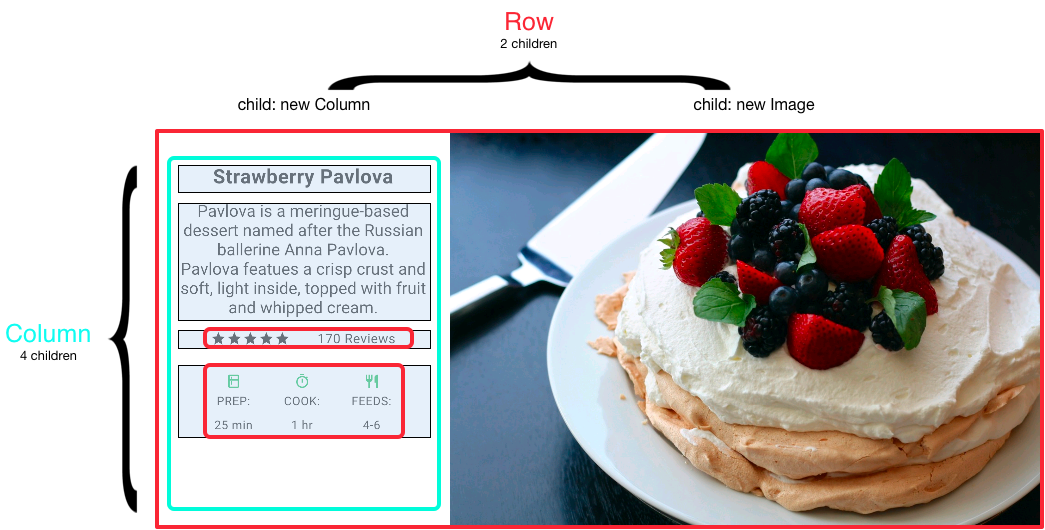
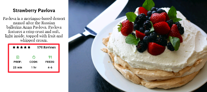 The outlined section is implemented as two rows. The ratings row contains
five stars and the number of reviews. The icons row contains three
columns of icons and text.
概述的部分实现为两行,评级一行包含五颗星和评论的数量,
图标一行包含由图标与文本组成的三列。
The widget tree for the ratings row:
以下是评级行的 widget 树形图:
The outlined section is implemented as two rows. The ratings row contains
five stars and the number of reviews. The icons row contains three
columns of icons and text.
概述的部分实现为两行,评级一行包含五颗星和评论的数量,
图标一行包含由图标与文本组成的三列。
The widget tree for the ratings row:
以下是评级行的 widget 树形图:
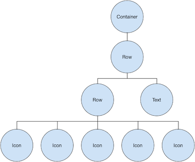 The `ratings` variable creates a row containing a smaller row
of 5-star icons, and text:
`ratings` 变量创建了一个行,
其中包含较小的由 5 个星形图标和文本组成的一行:
```dart
final stars = Row(
mainAxisSize: MainAxisSize.min,
children: [
Icon(Icons.star, color: Colors.green[500]),
Icon(Icons.star, color: Colors.green[500]),
Icon(Icons.star, color: Colors.green[500]),
const Icon(Icons.star, color: Colors.black),
const Icon(Icons.star, color: Colors.black),
],
);
final [!ratings!] = Container(
padding: const EdgeInsets.all(20),
child: Row(
mainAxisAlignment: MainAxisAlignment.spaceEvenly,
children: [
stars,
const Text(
'170 Reviews',
style: TextStyle(
color: Colors.black,
fontWeight: FontWeight.w800,
fontFamily: 'Roboto',
letterSpacing: 0.5,
fontSize: 20,
),
),
],
),
);
```
:::tip
To minimize the visual confusion that can result from
heavily nested layout code, implement pieces of the UI
in variables and functions.
为了最大限度地减少高度嵌套的布局代码可能导致的视觉混乱,
可以在变量和函数中实现 UI 的各个部分。
:::
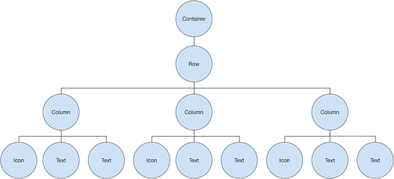
The icons row, below the ratings row, contains 3 columns;
each column contains an icon and two lines of text,
as you can see in its widget tree:
评级行下方的图标行包含 3 列,每列包含一个图标和两行文本,
你可以在其 widget 树中看到:
The `ratings` variable creates a row containing a smaller row
of 5-star icons, and text:
`ratings` 变量创建了一个行,
其中包含较小的由 5 个星形图标和文本组成的一行:
```dart
final stars = Row(
mainAxisSize: MainAxisSize.min,
children: [
Icon(Icons.star, color: Colors.green[500]),
Icon(Icons.star, color: Colors.green[500]),
Icon(Icons.star, color: Colors.green[500]),
const Icon(Icons.star, color: Colors.black),
const Icon(Icons.star, color: Colors.black),
],
);
final [!ratings!] = Container(
padding: const EdgeInsets.all(20),
child: Row(
mainAxisAlignment: MainAxisAlignment.spaceEvenly,
children: [
stars,
const Text(
'170 Reviews',
style: TextStyle(
color: Colors.black,
fontWeight: FontWeight.w800,
fontFamily: 'Roboto',
letterSpacing: 0.5,
fontSize: 20,
),
),
],
),
);
```
:::tip
To minimize the visual confusion that can result from
heavily nested layout code, implement pieces of the UI
in variables and functions.
为了最大限度地减少高度嵌套的布局代码可能导致的视觉混乱,
可以在变量和函数中实现 UI 的各个部分。
:::
The icons row, below the ratings row, contains 3 columns;
each column contains an icon and two lines of text,
as you can see in its widget tree:
评级行下方的图标行包含 3 列,每列包含一个图标和两行文本,
你可以在其 widget 树中看到:
 The `iconList` variable defines the icons row:
`iconList` 变量定义了图标行:
```dart
const descTextStyle = TextStyle(
color: Colors.black,
fontWeight: FontWeight.w800,
fontFamily: 'Roboto',
letterSpacing: 0.5,
fontSize: 18,
height: 2,
);
// DefaultTextStyle.merge() allows you to create a default text
// style that is inherited by its child and all subsequent children.
final [!iconList!] = DefaultTextStyle.merge(
style: descTextStyle,
child: Container(
padding: const EdgeInsets.all(20),
child: Row(
mainAxisAlignment: MainAxisAlignment.spaceEvenly,
children: [
Column(
children: [
Icon(Icons.kitchen, color: Colors.green[500]),
const Text('PREP:'),
const Text('25 min'),
],
),
Column(
children: [
Icon(Icons.timer, color: Colors.green[500]),
const Text('COOK:'),
const Text('1 hr'),
],
),
Column(
children: [
Icon(Icons.restaurant, color: Colors.green[500]),
const Text('FEEDS:'),
const Text('4-6'),
],
),
],
),
),
);
```
The `leftColumn` variable contains the ratings and icons rows,
as well as the title and text that describes the Pavlova:
`leftColumn` 变量包含评级和图标行,
以及蛋糕介绍的标题和文本:
```dart
final [!leftColumn!] = Container(
padding: const EdgeInsets.fromLTRB(20, 30, 20, 20),
child: Column(children: [titleText, subTitle, ratings, iconList]),
);
```
The left column is placed in a `SizedBox` to constrain its width.
Finally, the UI is constructed with the entire row (containing the
left column and the image) inside a `Card`.
左列放置在 `Container` 中以限制其宽度。最后,UI 由 `Card` 内的整行(包含左列和图像)构成。
The [Pavlova image][] is from [Pixabay][].
You can embed an image from the net using `Image.network()` but,
for this example, the image is saved to an images directory in the project,
added to the [pubspec file][], and accessed using `Images.asset()`.
For more information, see [Adding assets and images][].
[蛋糕图片][Pavlova image] 来自 [Pixabay][] 网站。
你可以使用 `Image.network()` 从网络上引用图像,
但是在本例图像将保存到项目中的一个图像目录中,
添加到 [pubspec 文件][pubspec file],并使用 `Images.asset()` 访问。
更多信息可以查看文档中关于 [添加资源和图片][Adding assets and images] 这一章。
```dart
body: Center(
child: Container(
margin: const EdgeInsets.fromLTRB(0, 40, 0, 30),
height: 600,
child: Card(
child: Row(
crossAxisAlignment: CrossAxisAlignment.start,
children: [
SizedBox(width: 440, child: leftColumn),
mainImage,
],
),
),
),
),
```
:::tip
The Pavlova example runs best horizontally on a wide device,
such as a tablet. If you are running this example in the iOS simulator,
you can select a different device using the **Hardware > Device** menu.
For this example, we recommend the iPad Pro.
You can change its orientation to landscape mode using
**Hardware > Rotate**. You can also change the size of the
simulator window (without changing the number of logical pixels)
using **Window > Scale**.
蛋糕介绍的例子在宽屏设备(如平板电脑)上横向运行效果最佳。
如果在 iOS 模拟器中运行这个示例,
可以使用 **Hardware > Device** 菜单选择不同的设备。
在本例中,我们推荐 iPad Pro。
你可以使用 **Hardware > Rotate** 将其方向更改为横向模式。
你还可以使用 **Window > Scale** 更改模拟器窗口的大小
(不改变逻辑像素的数量)。
:::
**App source:** [pavlova](https://github.com/cfug/flutter.cn/tree/main/examples/layout/pavlova)
**App 源码:**[pavlova](https://github.com/cfug/flutter.cn/tree/main/examples/layout/pavlova)
The `iconList` variable defines the icons row:
`iconList` 变量定义了图标行:
```dart
const descTextStyle = TextStyle(
color: Colors.black,
fontWeight: FontWeight.w800,
fontFamily: 'Roboto',
letterSpacing: 0.5,
fontSize: 18,
height: 2,
);
// DefaultTextStyle.merge() allows you to create a default text
// style that is inherited by its child and all subsequent children.
final [!iconList!] = DefaultTextStyle.merge(
style: descTextStyle,
child: Container(
padding: const EdgeInsets.all(20),
child: Row(
mainAxisAlignment: MainAxisAlignment.spaceEvenly,
children: [
Column(
children: [
Icon(Icons.kitchen, color: Colors.green[500]),
const Text('PREP:'),
const Text('25 min'),
],
),
Column(
children: [
Icon(Icons.timer, color: Colors.green[500]),
const Text('COOK:'),
const Text('1 hr'),
],
),
Column(
children: [
Icon(Icons.restaurant, color: Colors.green[500]),
const Text('FEEDS:'),
const Text('4-6'),
],
),
],
),
),
);
```
The `leftColumn` variable contains the ratings and icons rows,
as well as the title and text that describes the Pavlova:
`leftColumn` 变量包含评级和图标行,
以及蛋糕介绍的标题和文本:
```dart
final [!leftColumn!] = Container(
padding: const EdgeInsets.fromLTRB(20, 30, 20, 20),
child: Column(children: [titleText, subTitle, ratings, iconList]),
);
```
The left column is placed in a `SizedBox` to constrain its width.
Finally, the UI is constructed with the entire row (containing the
left column and the image) inside a `Card`.
左列放置在 `Container` 中以限制其宽度。最后,UI 由 `Card` 内的整行(包含左列和图像)构成。
The [Pavlova image][] is from [Pixabay][].
You can embed an image from the net using `Image.network()` but,
for this example, the image is saved to an images directory in the project,
added to the [pubspec file][], and accessed using `Images.asset()`.
For more information, see [Adding assets and images][].
[蛋糕图片][Pavlova image] 来自 [Pixabay][] 网站。
你可以使用 `Image.network()` 从网络上引用图像,
但是在本例图像将保存到项目中的一个图像目录中,
添加到 [pubspec 文件][pubspec file],并使用 `Images.asset()` 访问。
更多信息可以查看文档中关于 [添加资源和图片][Adding assets and images] 这一章。
```dart
body: Center(
child: Container(
margin: const EdgeInsets.fromLTRB(0, 40, 0, 30),
height: 600,
child: Card(
child: Row(
crossAxisAlignment: CrossAxisAlignment.start,
children: [
SizedBox(width: 440, child: leftColumn),
mainImage,
],
),
),
),
),
```
:::tip
The Pavlova example runs best horizontally on a wide device,
such as a tablet. If you are running this example in the iOS simulator,
you can select a different device using the **Hardware > Device** menu.
For this example, we recommend the iPad Pro.
You can change its orientation to landscape mode using
**Hardware > Rotate**. You can also change the size of the
simulator window (without changing the number of logical pixels)
using **Window > Scale**.
蛋糕介绍的例子在宽屏设备(如平板电脑)上横向运行效果最佳。
如果在 iOS 模拟器中运行这个示例,
可以使用 **Hardware > Device** 菜单选择不同的设备。
在本例中,我们推荐 iPad Pro。
你可以使用 **Hardware > Rotate** 将其方向更改为横向模式。
你还可以使用 **Window > Scale** 更改模拟器窗口的大小
(不改变逻辑像素的数量)。
:::
**App source:** [pavlova](https://github.com/cfug/flutter.cn/tree/main/examples/layout/pavlova)
**App 源码:**[pavlova](https://github.com/cfug/flutter.cn/tree/main/examples/layout/pavlova)
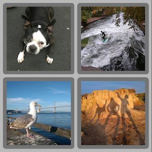
 Uses `GridView.extent` to create a grid with tiles a maximum
150 pixels wide.
使用 `GridView.extent` 创建一个最大宽度为 150 像素的网格。
**App source:** [grid_and_list](https://github.com/cfug/flutter.cn/tree/main/examples/layout/grid_and_list)
**App 源码:**[grid_and_list](https://github.com/cfug/flutter.cn/tree/main/examples/layout/grid_and_list)
Uses `GridView.extent` to create a grid with tiles a maximum
150 pixels wide.
使用 `GridView.extent` 创建一个最大宽度为 150 像素的网格。
**App source:** [grid_and_list](https://github.com/cfug/flutter.cn/tree/main/examples/layout/grid_and_list)
**App 源码:**[grid_and_list](https://github.com/cfug/flutter.cn/tree/main/examples/layout/grid_and_list)
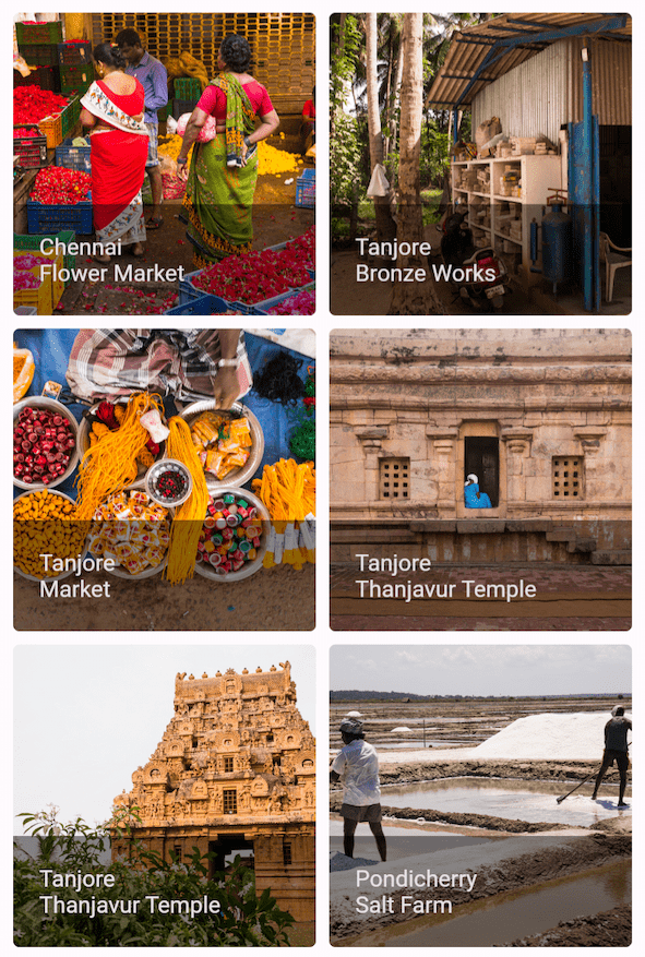 Uses `GridView.count` to create a grid that's 2 tiles
wide in portrait mode, and 3 tiles wide in landscape mode.
The titles are created by setting the `footer` property for
each [`GridTile`][].
使用 `GridView.count` 创建一个网格,它在竖屏模式下有两行,在横屏模式下有三行。
可以通过为每个 [`GridTile`][] 设置 `footer` 属性来创建标题。
**Dart code:**
[`grid_list_demo.dart`](https://github.com/cfug/flutter.cn/tree/main/examples/layout/gallery/lib/grid_list_demo.dart)
**Dart 代码:**[`grid_list_demo.dart`](https://github.com/cfug/flutter.cn/tree/main/examples/layout/gallery/lib/grid_list_demo.dart)
Uses `GridView.count` to create a grid that's 2 tiles
wide in portrait mode, and 3 tiles wide in landscape mode.
The titles are created by setting the `footer` property for
each [`GridTile`][].
使用 `GridView.count` 创建一个网格,它在竖屏模式下有两行,在横屏模式下有三行。
可以通过为每个 [`GridTile`][] 设置 `footer` 属性来创建标题。
**Dart code:**
[`grid_list_demo.dart`](https://github.com/cfug/flutter.cn/tree/main/examples/layout/gallery/lib/grid_list_demo.dart)
**Dart 代码:**[`grid_list_demo.dart`](https://github.com/cfug/flutter.cn/tree/main/examples/layout/gallery/lib/grid_list_demo.dart)
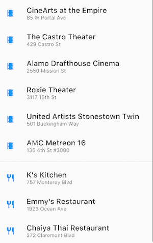 Uses `ListView` to display a list of businesses using
`ListTile`s. A `Divider` separates the theaters from
the restaurants.
使用 `ListView` 的业务列表,它使用了多个 `ListTile`。`Divider` 将餐厅从剧院中分隔开。
**App source:** [grid_and_list](https://github.com/cfug/flutter.cn/tree/main/examples/layout/grid_and_list)
**App 源码:**[grid_and_list](https://github.com/cfug/flutter.cn/tree/main/examples/layout/grid_and_list)
Uses `ListView` to display a list of businesses using
`ListTile`s. A `Divider` separates the theaters from
the restaurants.
使用 `ListView` 的业务列表,它使用了多个 `ListTile`。`Divider` 将餐厅从剧院中分隔开。
**App source:** [grid_and_list](https://github.com/cfug/flutter.cn/tree/main/examples/layout/grid_and_list)
**App 源码:**[grid_and_list](https://github.com/cfug/flutter.cn/tree/main/examples/layout/grid_and_list)
 Uses `ListView` to display the [`Colors`][] from
the [Material 2 Design palette][]
for a particular color family.
使用 `ListView` 展示特定颜色系列
[Material 2 Design 调色板][Material 2 Design palette] 中的 [`Colors`][]。
**Dart code:**
[`colors_demo.dart`](https://github.com/cfug/flutter.cn/tree/main/examples/layout/gallery/lib/colors_demo.dart)
**Dart 代码:**[`colors_demo.dart`](https://github.com/cfug/flutter.cn/tree/main/examples/layout/gallery/lib/colors_demo.dart)
Uses `ListView` to display the [`Colors`][] from
the [Material 2 Design palette][]
for a particular color family.
使用 `ListView` 展示特定颜色系列
[Material 2 Design 调色板][Material 2 Design palette] 中的 [`Colors`][]。
**Dart code:**
[`colors_demo.dart`](https://github.com/cfug/flutter.cn/tree/main/examples/layout/gallery/lib/colors_demo.dart)
**Dart 代码:**[`colors_demo.dart`](https://github.com/cfug/flutter.cn/tree/main/examples/layout/gallery/lib/colors_demo.dart)
 Uses `Stack` to overlay a `Container`
(that displays its `Text` on a translucent
black background) on top of a `CircleAvatar`.
The `Stack` offsets the text using the `alignment` property and
`Alignment`s.
在 `CircleAvatar` 的上面使用 `Stack` 覆盖 `Container`
(在透明的黑色背景上展示它的 `Text`)。
`Stack` 使用 `alignment` 属性和 `Alignment` 让文本偏移。
**App source:** [card_and_stack](https://github.com/cfug/flutter.cn/tree/main/examples/layout/card_and_stack)
**App 源码:**[card_and_stack](https://github.com/cfug/flutter.cn/tree/main/examples/layout/card_and_stack)
Uses `Stack` to overlay a `Container`
(that displays its `Text` on a translucent
black background) on top of a `CircleAvatar`.
The `Stack` offsets the text using the `alignment` property and
`Alignment`s.
在 `CircleAvatar` 的上面使用 `Stack` 覆盖 `Container`
(在透明的黑色背景上展示它的 `Text`)。
`Stack` 使用 `alignment` 属性和 `Alignment` 让文本偏移。
**App source:** [card_and_stack](https://github.com/cfug/flutter.cn/tree/main/examples/layout/card_and_stack)
**App 源码:**[card_and_stack](https://github.com/cfug/flutter.cn/tree/main/examples/layout/card_and_stack)
 Uses `Stack` to overlay an icon on top of an image.
使用 `Stack` 将渐变叠加到图片的顶部,
渐变可以将工具栏的图标和图片区分开来。
**Dart code:**
[`bottom_navigation_demo.dart`](https://github.com/cfug/flutter.cn/tree/main/examples/layout/gallery/lib/bottom_navigation_demo.dart)
**Dart 代码:**[`bottom_navigation_demo.dart`](https://github.com/cfug/flutter.cn/tree/main/examples/layout/gallery/lib/bottom_navigation_demo.dart)
Uses `Stack` to overlay an icon on top of an image.
使用 `Stack` 将渐变叠加到图片的顶部,
渐变可以将工具栏的图标和图片区分开来。
**Dart code:**
[`bottom_navigation_demo.dart`](https://github.com/cfug/flutter.cn/tree/main/examples/layout/gallery/lib/bottom_navigation_demo.dart)
**Dart 代码:**[`bottom_navigation_demo.dart`](https://github.com/cfug/flutter.cn/tree/main/examples/layout/gallery/lib/bottom_navigation_demo.dart)
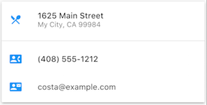 A `Card` containing 3 ListTiles and sized by wrapping
it with a `SizedBox`. A `Divider` separates the first
and second `ListTiles`.
包含 3 个 ListTile 的 `Card`,并且通过被 `SizedBox` 包住来调整大小。
`Divider` 分隔了第一个和第二个 `ListTiles`。
**App source:** [card_and_stack](https://github.com/cfug/flutter.cn/tree/main/examples/layout/card_and_stack)
**App 源码:**[card_and_stack](https://github.com/cfug/flutter.cn/tree/main/examples/layout/card_and_stack)
A `Card` containing 3 ListTiles and sized by wrapping
it with a `SizedBox`. A `Divider` separates the first
and second `ListTiles`.
包含 3 个 ListTile 的 `Card`,并且通过被 `SizedBox` 包住来调整大小。
`Divider` 分隔了第一个和第二个 `ListTiles`。
**App source:** [card_and_stack](https://github.com/cfug/flutter.cn/tree/main/examples/layout/card_and_stack)
**App 源码:**[card_and_stack](https://github.com/cfug/flutter.cn/tree/main/examples/layout/card_and_stack)
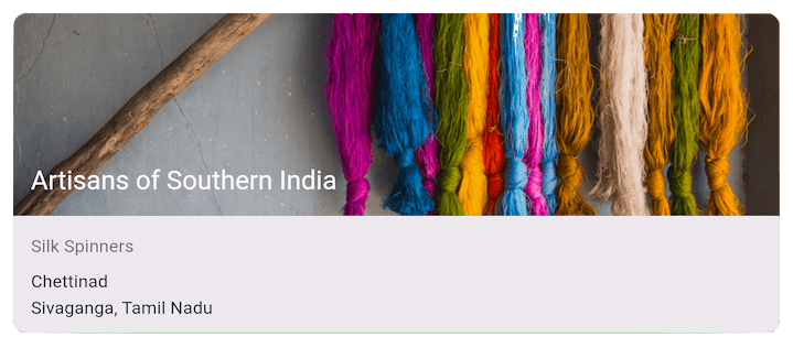 A `Card` containing an image and text.
包含图片和文本的 `Card`。
**Dart code:**
[`cards_demo.dart`](https://github.com/cfug/flutter.cn/tree/main/examples/layout/gallery/lib/cards_demo.dart)
**Dart 代码:**[`cards_demo.dart`](https://github.com/cfug/flutter.cn/tree/main/examples/layout/gallery/lib/cards_demo.dart)
A `Card` containing 3 `ListTile`s.
包含 3 个 `ListTiles` 的 `Card`。
**App source:** [card_and_stack](https://github.com/cfug/flutter.cn/tree/main/examples/layout/card_and_stack)
**App 源码:** [card_and_stack](https://github.com/cfug/flutter.cn/tree/main/examples/layout/card_and_stack)
A `Card` containing an image and text.
包含图片和文本的 `Card`。
**Dart code:**
[`cards_demo.dart`](https://github.com/cfug/flutter.cn/tree/main/examples/layout/gallery/lib/cards_demo.dart)
**Dart 代码:**[`cards_demo.dart`](https://github.com/cfug/flutter.cn/tree/main/examples/layout/gallery/lib/cards_demo.dart)
A `Card` containing 3 `ListTile`s.
包含 3 个 `ListTiles` 的 `Card`。
**App source:** [card_and_stack](https://github.com/cfug/flutter.cn/tree/main/examples/layout/card_and_stack)
**App 源码:** [card_and_stack](https://github.com/cfug/flutter.cn/tree/main/examples/layout/card_and_stack)
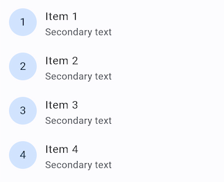 Uses `ListTile` with leading widgets.
leading widget 使用 `ListTile`。
**Dart code:**
[`list_demo.dart`](https://github.com/cfug/flutter.cn/tree/main/examples/layout/gallery/lib/list_demo.dart)
**Dart 代码:**
[`list_demo.dart`](https://github.com/cfug/flutter.cn/tree/main/examples/layout/gallery/lib/list_demo.dart)
Uses `ListTile` with leading widgets.
leading widget 使用 `ListTile`。
**Dart code:**
[`list_demo.dart`](https://github.com/cfug/flutter.cn/tree/main/examples/layout/gallery/lib/list_demo.dart)
**Dart 代码:**
[`list_demo.dart`](https://github.com/cfug/flutter.cn/tree/main/examples/layout/gallery/lib/list_demo.dart)