# 自动适配不同平台操作体验
> 了解更多 Flutter 的平台适配机制。
## Adaptation philosophy
## 适配哲学
In general, two cases of platform adaptiveness exist:
平台适配通常有两种情形:
1. Things that are behaviors of the OS environment
(such as text editing and scrolling) and that
would be 'wrong' if a different behavior took place.
操作系统所特有的操作体验(例如文本编辑和滚动)。
如果操作体验与操作系统不一致,则通常会被认为是「错误的」。
2. Things that are conventionally implemented in apps using
the OEM's SDKs (such as using parallel tabs on iOS or
showing an [`android.app.AlertDialog`][] on Android).
使用 OEM 提供的 SDK 实现的功能体验
(例如 iOS 常使用的选项卡,
Android 使用 [`android.app.AlertDialog`][] 显示一个提示窗口)。
This article mainly covers the automatic adaptations
provided by Flutter in case 1 on Android and iOS.
本文囊括了 Flutter 为解决情形 1 而提供的覆盖 Android 和 iOS 的自动适配。
For case 2, Flutter bundles the means to produce the
appropriate effects of the platform conventions but doesn't
adapt automatically when app design choices are needed.
For a discussion, see [issue #8410][] and the
[Material/Cupertino adaptive widget problem definition][].
对于情形 2,Flutter 提供了一些工具可以生成符合平台习惯的体验,
但是不会根据平台自动适配,需要根据 App 设计来手工选择。
更多有关的讨论,请访问 [issue #8410][] 和这个文档
[定义 Material/Cupertino widget 适配问题][Material/Cupertino adaptive widget problem definition]
For an example of an app using different information
architecture structures on Android and iOS but sharing
the same content code, see the [platform_design code samples][].
如果一个应用需要在 Android 和 iOS 不同架构上使用相同的代码,
请参阅 [platform_design 这份代码示例][platform_design code samples]。
:::secondary
Preliminary guides addressing case 2
are being added to the UI components section.
You can request additional guides by commenting on [issue #8427][8427].
本文档的 UI 组件部分正在添加有关情形 2 的指南。
如果你有更多的需求,请在 [issue #8427][8427] 中留言让我们知道。
:::
[`android.app.AlertDialog`]: https://developer.android.google.cn/reference/android/app/AlertDialog.html
[issue #8410]: https://github.com/flutter/flutter/issues/8410#issuecomment-468034023
[Material/Cupertino adaptive widget problem definition]: https://bit.ly/flutter-adaptive-widget-problem
[platform_design code samples]: https://github.com/flutter/samples/tree/main/platform_design
## Page navigation
## 页面导航
Flutter provides the navigation patterns seen on Android
and iOS and also automatically adapts the navigation animation
to the current platform.
Flutter 分别为 Android 和 iOS 提供了各自平台的导航模式,
并根据当前平台自动适配导航转场动画。
### Navigation transitions
### 导航转场动画
On **Android**, the default [`Navigator.push()`][] transition
is modeled after [`startActivity()`][],
which generally has one bottom-up animation variant.
**Android** 平台,默认提供的 [`Navigator.push()`][]
转场动画模仿了 [`startActivity()`][] 的动画,
即一种自下而上的动画效果。
On **iOS**:
**iOS** 平台:
* The default [`Navigator.push()`][] API produces an
iOS Show/Push style transition that animates from
end-to-start depending on the locale's RTL setting.
The page behind the new route also parallax-slides
in the same direction as in iOS.
iOS 的 [`Navigator.push()`][] API 提供了 iOS 上的
Show 转场动画(也被称为 Push 转场动画),
即根据语言的方向设置,执行一种从后到前的滚动动画效果。
在显示新页面的时候,原来的页面也会沿着相同的方向进行视差滚动。
* A separate bottom-up transition style exists when
pushing a page route where [`PageRoute.fullscreenDialog`][]
is true. This represents iOS's Present/Modal style
transition and is typically used on fullscreen modal pages.
当显示一个页面,且 [`PageRoute.fullscreenDialog`][] 是 true 的时候,
iOS 提供了另外一种自下而上的动画效果。
这个动画通常被用在展示全屏模态页,
也被称为 iOS 上的 Present 转场动画或 Modal 转场动画。
[`Navigator.push()`]: https://api.flutter-io.cn/flutter/widgets/Navigator/push.html
[`startActivity()`]: https://developer.android.google.cn/reference/kotlin/android/app/Activity#startactivity
[`PageRoute.fullscreenDialog`]: https://api.flutter-io.cn/flutter/widgets/PageRoute-class.html
### Platform-specific transition details
### 不同平台的转场动画细节
On **Android**, Flutter uses the [`ZoomPageTransitionsBuilder`][] animation.
When the user taps on an item, the UI zooms in to a screen that features that item.
When the user taps to go back, the UI zooms out to the previous screen.
**Android** 平台上,Flutter 使用 [`ZoomPageTransitionsBuilder`][] 转场动画。
当用户进行了路由跳转,界面会缩放至下一个页面。
当用户返回上一页时,界面会缩放回上一个页面。
On **iOS** when the push style transition is used,
Flutter's bundled [`CupertinoNavigationBar`][]
and [`CupertinoSliverNavigationBar`][] nav bars
automatically animate each subcomponent to its corresponding
subcomponent on the next or previous page's
`CupertinoNavigationBar` or `CupertinoSliverNavigationBar`.
当在 **iOS** 平台上使用 Push 转场特效的时候,
Flutter 内置的 [`CupertinoNavigationBar`][]
和 [`CupertinoSliverNavigationBar`][]
会自动的给当前页下一页的子组件使用正确的动画效果
(`CupertinoNavigationBar` 或者 `CupertinoSliverNavigationBar`)。
[`ZoomPageTransitionsBuilder`]: https://api.flutter-io.cn/flutter/material/ZoomPageTransitionsBuilder-class.html
[`CupertinoNavigationBar`]: https://api.flutter-io.cn/flutter/cupertino/CupertinoNavigationBar-class.html
[`CupertinoSliverNavigationBar`]: https://api.flutter-io.cn/flutter/cupertino/CupertinoSliverNavigationBar-class.html
### Back navigation
### 返回导航
On **Android**,
the OS back button, by default, is sent to Flutter
and pops the top route of the [`WidgetsApp`][]'s Navigator.
**Android** 平台,通常操作系统的返回按钮触发的事件会发给 Flutter,
并弹出 [`WidgetsApp`][] 路由的最顶端。
On **iOS**,
an edge swipe gesture can be used to pop the top route.
**iOS** 平台,从屏幕边缘的轻扫手势会弹出路由的最顶端。
[`WidgetsApp`]: https://api.flutter-io.cn/flutter/widgets/WidgetsApp-class.html
## Scrolling
## 滚动
Scrolling is an important part of the platform's
look and feel, and Flutter automatically adjusts
the scrolling behavior to match the current platform.
滚动是不同平台提供独有体验非常重要的一环,
Flutter 会根据当前的平台自动适配滚动体验。
### Physics simulation
### 物理仿真
Android and iOS both have complex scrolling physics
simulations that are difficult to describe verbally.
Generally, iOS's scrollable has more weight and
dynamic friction but Android has more static friction.
Therefore iOS gains high speed more gradually but stops
less abruptly and is more slippery at slow speeds.
Android 和 iOS 平台都提供了非常复杂的滚动物理仿真,
因而很难用语言来描述。通常来说,
iOS 的滚动通常提供更多的分量和动态的阻力;
而 Android 则更多的使用静态的阻力。
所以,iOS 随着滚动慢慢的达到高速,且不会突然的停止,
而且在慢速的时候显得更顺滑。
### Overscroll behavior
### 滚动边界行为
On **Android**,
scrolling past the edge of a scrollable shows an
[overscroll glow indicator][] (based on the color
of the current Material theme).
**Android** 平台,滚动达到边界的时候,会显示
[滚动灰色指示][overscroll glow indicator]
(具体颜色根据 Material 主题而有所不同)。
On **iOS**, scrolling past the edge of a scrollable
[overscrolls][] with increasing resistance and snaps back.
**iOS** 平台,滚动达到边界的时候,会显示一个
[滚动边界][overscrolls] 的弹簧效果。
[overscroll glow indicator]: https://api.flutter-io.cn/flutter/widgets/GlowingOverscrollIndicator-class.html
[overscrolls]: https://api.flutter-io.cn/flutter/widgets/BouncingScrollPhysics-class.html
### Scrollbars
### 滚动条
On **Material-based platforms** (such as Android and web),
scrollbars are typically visible during scrolling
and may remain visible depending on the platform and theme.
在 **基于 Material 的平台**(例如 Android 和 Web)上,
滚动条通常会在滚动时显示,
并且可能会根据平台和主题持续保持可见。
On **Cupertino-based platforms** (such as iOS),
scrollbars are more minimal and generally only appear briefly
while the user is actively scrolling, fading out when interaction stops.
在 **基于 Cupertino 的平台**(例如 iOS)上,
滚动条则更加简约,通常只在用户主动滚动时短暂出现,
并在交互停止后淡出。
This difference reflects each platform’s visual conventions
and helps maintain a native look and feel across devices.
这种差异体现了各平台的视觉惯例,
有助于在不同设备上保持原生的观感与体验。
### Momentum
### 动量
On **iOS**,
repeated flings in the same direction stacks momentum
and builds more speed with each successive fling.
There is no equivalent behavior on Android.
**iOS** 平台,不停的按相同方向滚动会产生动量叠加,
从而连续滚动速度会越来越快。在 Android 平台上没有对应的行为。
### Return to top
### 返回顶部
On **iOS**,
tapping the OS status bar scrolls the primary
scroll controller to the top position.
There is no equivalent behavior on Android.
**iOS** 平台,点击操作系统的状态栏,主要的滚动条控制器会滚动到顶部。
Android 没有对应的行为(部分国产系统自己实现了该特性)。
## Typography
## 排版
When using the Material package,
the typography automatically defaults to the
font family appropriate for the platform.
Android uses the Roboto font.
iOS uses the San Francisco font.
当使用 Material package 的时候,排版会根据平台自动使用对应的字体。
Android 平台会使用 Roboto 字体,
而 iOS 则会使用系统自带的 San Francisco 字体。
When using the Cupertino package, the [default theme][]
uses the San Francisco font.
当使用 Cupertino package 的时候,[默认主题][default theme]
会使用 San Francisco 字体。
The San Francisco font license limits its usage to
software running on iOS, macOS, or tvOS only.
Therefore a fallback font is used when running on Android
if the platform is debug-overridden to iOS or the
default Cupertino theme is used.
San Francisco 字体的授权限制了它只能被用在运行于
iOS、macOS 和 tvOS 平台上的软件。
因此当运行在 Android 平台的时候,
即使强制覆盖系统平台为 iOS 或者使用 Cupertino 默认主题,
都会使用对应的替代字体。
You might choose to adapt the text styling of Material
widgets to match the default text styling on iOS.
You can see widget-specific examples in the
[UI Component section](#ui-components).
你可以选择将 Material widgets 的文本样式适配到 iOS 的默认文本样式。
你可以在 [UI 组件部分](#ui-components) 看到特定组件的例子。
[default theme]: https://github.com/flutter/flutter/blob/main/packages/flutter/lib/src/cupertino/text_theme.dart
## Iconography
## 图标
When using the Material package,
certain icons automatically show different
graphics depending on the platform.
For instance, the overflow button's three dots
are horizontal on iOS and vertical on Android.
The back button is a simple chevron on iOS and
has a stem/shaft on Android.
当使用 Material package 的时候,根据平台不同,图标的具体样式会有差别。
举例来说,更多按钮的图标,Android 上是竖直的三个点而 iOS 是横着的三个点;
退回按钮,iOS 是一个简单的 V 型标记,而 Android 平台,V 型标记有个短横线。
The material library also provides a set of
platform-adaptive icons through [`Icons.adaptive`][].
[`Icons.adaptive`]: https://api.flutter-io.cn/flutter/material/PlatformAdaptiveIcons-class.html
Material 也通过 [`Icons.adaptive`][] 提供了一系列根据平台自适应的图标。
## Haptic feedback
## 触摸反馈
The Material and Cupertino packages automatically
trigger the platform appropriate haptic feedback in
certain scenarios.
Material 和 Cupertino package 在特定场景下都会自动触发符合平台特点的触摸反馈。
For instance,
a word selection via text field long-press triggers a 'buzz'
vibrate on Android and not on iOS.
例如,在文本输入框控件里面长按选中单词会在 Android 设备上会触发震动,而 iOS 不会。
Scrolling through picker items on iOS triggers a
'light impact' knock and no feedback on Android.
在 iOS 滚动选择器项目列表,会触发一个很轻的敲击音效,而 Android 则不会。
## Text editing
## 文本编辑
Both the Material and Cupertino Text Input fields
support spellcheck and adapt to use the proper
spellcheck configuration for the platform,
and the proper spell check menu and highlight colors.
Material 和 Cupertino 文本输入框都支持拼写检查,
并能够根据平台调整使用合适的拼写检查配置,
以及合适的拼写检查菜单和高亮色。
Flutter also makes the below adaptations while editing
the content of text fields to match the current platform.
Flutter 会根据当前平台来适配正确的文本编辑体验。
### Keyboard gesture navigation
### 键盘手势导航
On **Android**,
horizontal swipes can be made on the soft keyboard's space key
to move the cursor in Material and Cupertino text fields.
**Android** 平台,
在虚拟键盘空格键上可以通过左右轻扫来移动光标,
Material 和 Cupertino 的文本输入框控件都支持该特性。
On **iOS** devices with 3D Touch capabilities,
a force-press-drag gesture could be made on the soft
keyboard to move the cursor in 2D via a floating cursor.
This works on both Material and Cupertino text fields.
**iOS** 设备提供了 3D Touch 兼容,
通过在虚拟键盘上使用长按并拖拽手势可以任意方向移动光标。
Material 和 Cupertino 都对这个功能提供了支持。
### Text selection toolbar
### 文本选中工具栏
With **Material on Android**,
the Android style selection toolbar is shown when
a text selection is made in a text field.
在 **Android** 平台上使用 **Material**,
在文本输入框里面选中文本会显示一个 Android 风格的文本选中工具栏。
With **Material on iOS** or when using **Cupertino**,
the iOS style selection toolbar is shown when a text
selection is made in a text field.
在 **iOS** 平台上使用 **Material** 或者在两个平台上都使用 **Cupertino**,
在文本输入框里面选中文本会展示一个 iOS 风格的文本选中工具栏。
### Single tap gesture
### 点击手势
With **Material on Android**,
a single tap in a text field puts the cursor at the
location of the tap.
在 **Android** 平台使用 **Material**,在文本控件中点击会移动光标到点击处。
A collapsed text selection also shows a draggable
handle to subsequently move the cursor.
同时,光标会有一个可移动的把手,随后可以通过这个把手移动光标。
With **Material on iOS** or when using **Cupertino**,
a single tap in a text field puts the cursor at the
nearest edge of the word tapped.
在 **iOS** 平台使用 **Material** 或者在两个平台都使用 **Cupertino**,
在文本空间中点击,会把光标移动到点击处最近的单词末尾。
Collapsed text selections don't have draggable handles on iOS.
在 iOS 平台上,光标是没有把手的。
### Long-press gesture
### 长按手势
With **Material on Android**,
a long press selects the word under the long press.
The selection toolbar is shown upon release.
在 **Android** 平台使用 **Material**,在单词上长按会选中单词,并在释放长按的时候显示文本选中工具栏。
With **Material on iOS** or when using **Cupertino**,
a long press places the cursor at the location of the
long press. The selection toolbar is shown upon release.
在 **iOS** 平台使用 **Material** 或者在两个平台都使用 **Cupertino**,长按会把光标放置到长按的位置,并在释放长按的时候显示文本选中工具栏。
### Long-press drag gesture
### 长按并拖放手势
With **Material on Android**,
dragging while holding the long press expands the words selected.
在 **Android** 平台上使用 **Material**,长按并拖拽会选中更多单词。
With **Material on iOS** or when using **Cupertino**,
dragging while holding the long press moves the cursor.
在 **iOS** 平台使用 **Material** 或者在两个平台都使用 **Cupertino**,长按并拖拽会移动光标。
### Double tap gesture
### 双击手势
On both Android and iOS,
a double tap selects the word receiving the
double tap and shows the selection toolbar.
Android 和 iOS 平台上,
双击选中一个单词都会收到双击手势事件,
并显示文本选中工具栏。
## UI components
## UI 组件
This section includes preliminary recommendations on how to adapt
Material widgets to deliver a natural and compelling experience on iOS.
Your feedback is welcomed on [issue #8427][8427].
本节包含有关如何调整 Material widget 以在
iOS 上提供自然且亮眼的体验的初步提议。
欢迎你对问题 [issue #8427][8427] 提出反馈。
[8427]: https://github.com/cfug/flutter.cn/issues/8427
### Widgets with .adaptive() constructors
### 带有 .adaptive() 构造的 widget
Several widgets support `.adaptive()` constructors.
The following table lists these widgets.
Adaptive constructors substitute the corresponding Cupertino components
when the app is run on an iOS device.
部分 widget 带有 `.adaptive()` 构造。
下方的表列出了这些 widget。
当应用程序在 iOS 设备上运行时,它们会自动以 Cupertino 的组件构造。
Widgets in the following table are used primarily for input,
selection, and to display system information.
Because these controls are tightly integrated with the operating system,
users have been trained to recognize and respond to them.
Therefore, we recommend that you follow platform conventions.
这些 widget 主要用于输入、选择和显示系统信息。
由于它们与系统高度相关,用户可能已经习惯于与它们产生对应的记忆和反应。
因此我们建议你在应用程序中采用各自平台的转化内容。
| Material widget | Cupertino widget | Adaptive constructor |
|---|---|---|
|
`Switch`|
`CupertinoSwitch`|[`Switch.adaptive()`][]|
|
`Slider`|
`CupertinoSlider`|[`Slider.adaptive()`][]|
|
`CircularProgressIndicator`|
`CupertinoActivityIndicator`|[`CircularProgressIndicator.adaptive()`][]|
|
`RefreshProgressIndicator`|
`CupertinoActivityIndicator`|[`RefreshIndicator.adaptive()`][]|
|
`Checkbox`| 
`CupertinoCheckbox`|[`Checkbox.adaptive()`][]|
|
`Radio`|
`CupertinoRadio`|[`Radio.adaptive()`][]|
|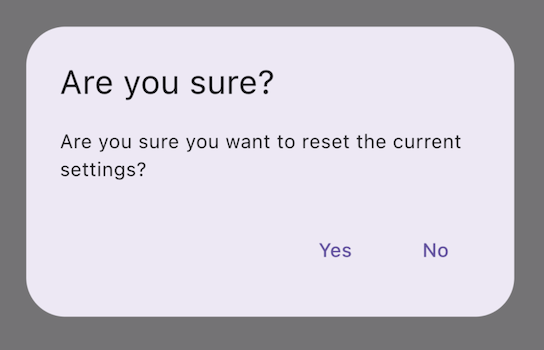
`AlertDialog`|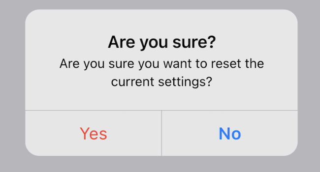
`CupertinoAlertDialog`|[`AlertDialog.adaptive()`][]|
[`AlertDialog.adaptive()`]: https://api.flutter-io.cn/flutter/material/AlertDialog/AlertDialog.adaptive.html
[`Checkbox.adaptive()`]: https://api.flutter-io.cn/flutter/material/Checkbox/Checkbox.adaptive.html
[`Radio.adaptive()`]: https://api.flutter-io.cn/flutter/material/Radio/Radio.adaptive.html
[`Switch.adaptive()`]: https://api.flutter-io.cn/flutter/material/Switch/Switch.adaptive.html
[`Slider.adaptive()`]: https://api.flutter-io.cn/flutter/material/Slider/Slider.adaptive.html
[`CircularProgressIndicator.adaptive()`]: https://api.flutter-io.cn/flutter/material/CircularProgressIndicator/CircularProgressIndicator.adaptive.html
[`RefreshIndicator.adaptive()`]: https://api.flutter-io.cn/flutter/material/RefreshIndicator/RefreshIndicator.adaptive.html
### Top app bar and navigation bar
### 顶部应用栏和导航栏
Since Android 12, the default UI for top app
bars follows the design guidelines defined in [Material 3][mat-appbar].
On iOS, an equivalent component called "Navigation Bars"
is defined in [Apple's Human Interface Guidelines][hig-appbar] (HIG).
自 Android 12 起,顶部应用栏的界面遵循 [Material 3][mat-appbar] 中定义的设计指南。
在 iOS 上,[Apple 的人机界面指南][hig-appbar] (HIG) 中定义了一个名为「导航栏」的等效组件。
Certain properties of app bars in Flutter apps should be adapted,
like system icons and page transitions.
These are already automatically adapted when using
the Material `AppBar` and `SliverAppBar` widgets.
You can also further customize the properties of these widgets to better
match iOS platform styles, as shown below.
Flutter 应用程序中应用栏的某些属性,例如系统图标和页面转场,都应该进行调整。
使用 Material `AppBar` 和 `SliverAppBar` widget 时,这些属性都已经自动调整。
你还可以进一步自定义它们的属性,以更好地匹配 iOS 的平台风格,如下所示。
```dart
// Map the text theme to iOS styles
TextTheme cupertinoTextTheme = TextTheme(
headlineMedium: CupertinoThemeData()
.textTheme
.navLargeTitleTextStyle
// fixes a small bug with spacing
.copyWith(letterSpacing: -1.5),
titleLarge: CupertinoThemeData().textTheme.navTitleTextStyle)
...
// Use iOS text theme on iOS devices
ThemeData(
textTheme: Platform.isIOS ? cupertinoTextTheme : null,
...
)
...
// Modify AppBar properties
AppBar(
surfaceTintColor: Platform.isIOS ? Colors.transparent : null,
shadowColor: Platform.isIOS ? CupertinoColors.darkBackgroundGray : null,
scrolledUnderElevation: Platform.isIOS ? .1 : null,
toolbarHeight: Platform.isIOS ? 44 : null,
...
),
```
But, because app bars are displayed alongside
other content in your page, it's only recommended to adapt the styling
so long as it's cohesive with the rest of your application. You can see
additional code samples and a further explanation in
[the GitHub discussion on app bar adaptations][appbar-post].
但是,由于顶栏是与页面中的其他内容一起显示的,
因此我们只建议调整样式,它只要能与应用程序的其余部分保持一致即可。
你可以在 [有关应用栏适配的 GitHub 讨论中][appbar-post]
查看其他代码示例和进一步说明。
[mat-appbar]: https://m3.material.io/components/top-app-bar/overview
[hig-appbar]: https://developer.apple.com/design/human-interface-guidelines/components/navigation-and-search/navigation-bars/
[appbar-post]: https://github.com/flutter/uxr/discussions/93
### Bottom navigation bars
### 底部导航栏
Since Android 12, the default UI for bottom navigation
bars follow the design guidelines defined in [Material 3][mat-navbar].
On iOS, an equivalent component called "Tab Bars"
is defined in [Apple's Human Interface Guidelines][hig-tabbar] (HIG).
自 Android 12 起,底部导航栏的界面遵循 [Material 3][mat-navbar] 中定义的设计指南。
在 iOS 上,[Apple 的人机界面指南][hig-tabbar] (HIG) 中定义了一个名为「标签页栏」的等效组件。
Since tab bars are persistent across your app, they should match your
own branding. However, if you choose to use Material's default
styling on Android, you might consider adapting to the default iOS
tab bars.
由于标签栏在你的应用程序中是持续存在的,因此它们应该与你自己的品牌匹配。
如果你选择在 Android 上使用 Material 的默认样式,
你应该要在考虑在 iOS 平台上使用 iOS 的标签页栏。
To implement platform-specific bottom navigation bars,
you can use Flutter's `NavigationBar` widget on Android
and the `CupertinoTabBar` widget on iOS.
Below is a code snippet you can
adapt to show a platform-specific navigation bars.
如果你要实现特定于平台的底部导航栏,
可以在 Android 上使用 Flutter 的 `NavigationBar` widget,
在 iOS 上使用 `CupertinoTabBar` widget。
下面是用于显示特定于平台的导航栏的代码片段。
```dart
final Map _navigationItems = {
'Menu': Platform.isIOS ? Icon(CupertinoIcons.house_fill) : Icon(Icons.home),
'Order': Icon(Icons.adaptive.share),
};
...
Scaffold(
body: _currentWidget,
bottomNavigationBar: Platform.isIOS
? CupertinoTabBar(
currentIndex: _currentIndex,
onTap: (index) {
setState(() => _currentIndex = index);
_loadScreen();
},
items: _navigationItems.entries
.map(
(entry) => BottomNavigationBarItem(
icon: entry.value,
label: entry.key,
))
.toList(),
)
: NavigationBar(
selectedIndex: _currentIndex,
onDestinationSelected: (index) {
setState(() => _currentIndex = index);
_loadScreen();
},
destinations: _navigationItems.entries
.map((entry) => NavigationDestination(
icon: entry.value,
label: entry.key,
))
.toList(),
));
```
[mat-navbar]: https://m3.material.io/components/navigation-bar/overview
[hig-tabbar]: https://developer.apple.com/design/human-interface-guidelines/components/navigation-and-search/tab-bars/
### Text fields
### 文本输入
Since Android 12, text fields follow the
[Material 3][m3-text-field] (M3) design guidelines.
On iOS, Apple's [Human Interface Guidelines][hig-text-field] (HIG) define
an equivalent component.
自 Android 12 起,文本输入组件的界面遵循 [Material 3][m3-text-field] 中定义的设计指南。
在 iOS 上,[Apple 的人机界面指南][hig-text-field] (HIG) 中定义了一个名为「文本栏」的等效组件。
Since text fields require user input,
their design should follow platform conventions.
由于用户需要用文本栏来输入,因此它们应该遵循平台习惯来展示。
To implement a platform-specific `TextField`
in Flutter, you can adapt the styling of the
Material `TextField`.
你可以调整 Material 材质的 `TextField` 的样式来实现对应平台的 `TextField`。
```dart
Widget _createAdaptiveTextField() {
final _border = OutlineInputBorder(
borderSide: BorderSide(color: CupertinoColors.lightBackgroundGray),
);
final iOSDecoration = InputDecoration(
border: _border,
enabledBorder: _border,
focusedBorder: _border,
filled: true,
fillColor: CupertinoColors.white,
hoverColor: CupertinoColors.white,
contentPadding: EdgeInsets.fromLTRB(10, 0, 0, 0),
);
return Platform.isIOS
? SizedBox(
height: 36.0,
child: TextField(
decoration: iOSDecoration,
),
)
: TextField();
}
```
To learn more about adapting text fields, check out
[the GitHub discussion on text fields][text-field-post].
You can leave feedback or ask questions in the discussion.
若你想要了解有关调整文本字段的更多信息,
请查看 [有关文本字段的 GitHub 讨论][text-field-post]。
你可以在讨论中留下反馈或提出问题。
[text-field-post]: https://github.com/flutter/uxr/discussions/95
[m3-text-field]: https://m3.material.io/components/text-fields/overview
[hig-text-field]: https://developer.apple.com/design/human-interface-guidelines/text-fields