# 大屏设备
> 将应用适配大屏时需注意的事项。
This page provides guidance on optimizing your
app to improve its behavior on large screens.
本页提供优化应用以改善其在大屏上行为的指导。
Flutter, like Android, defines [large screens][] as tablets,
foldables, and ChromeOS devices running Android. Flutter
_also_ defines large screen devices as web, desktop,
and iPads.
Flutter 与 Android 一样,将 [大屏][large screens] 定义为平板、折叠屏以及运行 Android 的 ChromeOS 设备。
Flutter **还** 将 Web、桌面与 iPad 视为大屏设备。
:::secondary 为什么大屏幕尤为重要?
Demand for large screens continues to increase.
As of January 2024,
more than [270 million active large screen][large screens]
and foldable devices run on Android and more than
[14.9 million iPad users][].
大屏需求持续增长。
截至 2024 年 1 月,Android 上活跃 [大屏][large screens] 与折叠设备超过 2.7 亿台,
[iPad 用户超过 1490 万][14.9 million iPad users]。
When your app supports large screens,
it also receives other benefits.
Optimizing your app to fill the screen.
For example, it:
应用支持大屏时还会获得其他好处。
优化应用以填满屏幕,例如:
* Improves your app's user engagement metrics.
提升应用用户参与度指标。
* Increases your app's visibility in the Play Store.
Recent [Play Store updates][] show ratings by
device type and indicates when an app lacks
large screen support.
提高应用在 Play Store 的可见度。
近期 [Play Store 更新][Play Store updates] 按设备类型显示评分,并标明应用是否缺少大屏支持。
* Ensures that your app meets iPadOS submission
guidelines and is [accepted in the App Store][].
确保应用符合 iPadOS 提交指南并在 [App Store 获准上架][accepted in the App Store]。
:::
[14.9 million iPad users]: https://www.statista.com/statistics/299632/tablet-shipments-apple/
[accepted in the App Store]: https://developer.apple.com/ipados/submit/
[large screens]: https://developer.android.google.cn/guide/topics/large-screens/get-started-with-large-screens
[Play Store updates]: https://developer.android.google.cn/2022/03/helping-users-discover-quality-apps-on.html
## Layout with GridView
## 使用 GridView 布局
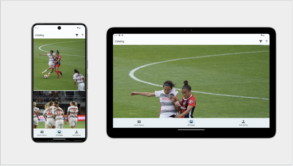
Consider the following screenshots of an app.
The app displays its UI in a `ListView`.
The image on the left shows the app running
on a mobile device. The image on the right shows the
app running on a large screen device
_before the advice on this page was applied_.
请看以下应用截图。应用在 `ListView` 中显示 UI。
左图为移动设备上的运行效果,右图为应用在大屏设备上运行、且 **尚未应用本页建议** 时的效果。
{:width="90%"}
This is not optimal.
这并不理想。
The [Android Large Screen App Quality Guidelines][guidelines]
and the [iOS equivalent][]
say that neither text nor boxes should take up the
full screen width. How to solve this in an adaptive way?
[Android 大屏应用质量指南][guidelines] 与 [iOS 对应指南][iOS equivalent] 均指出,
文字与方框都不应占满全屏宽度。
如何以自适应方式解决?
[guidelines]: https://developer.android.com/docs/quality-guidelines/large-screen-app-quality
[iOS equivalent]: https://developer.apple.com/design/human-interface-guidelines/designing-for-ipados
A common solution uses `GridView`, as shown in the next section.
常见方案是使用 `GridView`,如下一节所示。
### GridView
You can use the `GridView` widget to transform
your existing `ListView` into more reasonably-sized items.
可用 `GridView` widget 将现有 `ListView` 转为尺寸更合理的项。
`GridView` is similar to the [`ListView`][] widget,
but instead of handling only a list of widgets arranged linearly,
`GridView` can arrange widgets in a two-dimensional array.
`GridView` 与 [`ListView`][] widget 类似,
但不仅能线性排列 widget 列表,还能在二维数组中排列 widget。
`GridView` also has constructors that are similar to `ListView`.
The `ListView` default constructor maps to `GridView.count`,
and `ListView.builder` is similar to `GridView.builder`.
`GridView` 也有与 `ListView` 类似的构造函数。
`ListView` 默认构造函数对应 `GridView.count`,`ListView.builder` 类似 `GridView.builder`。
`GridView` has some additional constructors for more custom layouts.
To learn more, visit the [`GridView`][] API page.
`GridView` 还有用于更自定义布局的额外构造函数。
更多信息请访问 [`GridView`][] API 页面。
[`GridView`]: https://api.flutter-io.cn/flutter/widgets/GridView-class.html
[`ListView`]: https://api.flutter-io.cn/flutter/widgets/ListView-class.html
For example, if your original app used a `ListView.builder`,
swap that out for a `GridView.builder`.
If your app has a large number of items,
it's recommended to use this builder constructor to only
build the item widgets that are actually visible.
例如,若原应用使用 `ListView.builder`,可换成 `GridView.builder`。
若项很多,建议使用 builder 构造函数仅构建实际可见的项 widget。
Most of the parameters in the constructor are the same between
the two widgets, so it's a straightforward swap.
However, you need to figure out what to set for the `gridDelegate`.
两个 widget 的构造函数参数大多相同,替换较直接。
但需确定 `gridDelegate` 的设置。
Flutter provides powerful premade `gridDelegates`
that you can use, namely:
Flutter 提供强大的预制 `gridDelegates`,可供使用,即:
[`SliverGridDelegateWithFixedCrossAxisCount`][]
Lets you assign a specific number of columns to your grid.
[`SliverGridDelegateWithFixedCrossAxisCount`][]
为网格指定固定列数。
[`SliverGridDelegateWithMaxCrossAxisExtent`][]
Lets you define a max item width.
[`SliverGridDelegateWithMaxCrossAxisExtent`][]
定义项的最大宽度。
[`SliverGridDelegateWithFixedCrossAxisCount`]: https://api.flutter-io.cn/flutter/rendering/SliverGridDelegateWithFixedCrossAxisCount-class.html
[`SliverGridDelegateWithMaxCrossAxisExtent`]: https://api.flutter-io.cn/flutter/rendering/SliverGridDelegateWithMaxCrossAxisExtent-class.html
:::secondary
Don't use the grid delegate for these classes that lets
you set the column count directly and then hardcode
the number of columns based on whether the device
is a tablet, or whatever.
The number of columns should be based on the size of
the window and not the size of the physical device.
不要使用可直接设置列数并据设备是否为平板等硬编码列数的 grid delegate。
列数应基于窗口尺寸,而非物理设备尺寸。
This distinction is important because many mobile
devices support multi-window mode, which can
cause your app to be rendered in a space smaller than
the physical size of the display. Also, Flutter apps
can run on web and desktop, which might be sized in many ways.
**For this reason, use `MediaQuery` to get the app window size
rather than the physical device size.**
这一区别很重要,因为许多移动设备支持多窗口模式,应用可能渲染在小于物理显示的空间中。
Flutter 应用也可在 Web 与桌面以多种尺寸运行。
**因此请用 `MediaQuery` 获取应用窗口尺寸,而非物理设备尺寸。**
:::
### Other solutions
### 其他方案
Another way to approach these situations is to
use the `maxWidth` property of `BoxConstraints`.
This involves the following:
另一种方式是使用 `BoxConstraints` 的 `maxWidth` 属性,涉及:
* Wrap the `GridView`in a `ConstrainedBox` and give
it a `BoxConstraints` with a maximum width set.
用 `ConstrainedBox` 包裹 `GridView`,并设置带最大宽度的 `BoxConstraints`。
* Use a `Container` instead of a `ConstrainedBox`
if you want other functionality like setting the
background color.
若需设置背景色等其他功能,可用 `Container` 替代 `ConstrainedBox`。
For choosing the maximum width value,
consider using the values recommended
by Material 3 in the [Applying layout][] guide.
选择最大宽度时,可考虑 Material 3 在 [Applying layout][] 指南中的推荐值。
[Applying layout]: https://m3.material.io/foundations/layout/applying-layout/window-size-classes
## Foldables
## 折叠屏
As mentioned previously, Android and Flutter both
recommend in their design guidance **not**
to lock screen orientation,
but some apps lock screen orientation anyway.
Be aware that this can cause problems when running your
app on a foldable device.
如前所述,Android 与 Flutter 设计指南均 **不** 建议锁定屏幕方向,但部分应用仍会锁定。
请注意,在折叠屏上运行可能导致问题。
When running on a foldable, the app might look ok
when the device is folded. But when unfolding,
you might find the app letterboxed.
折叠屏折叠时应用可能正常,展开后可能出现 letterboxing(信箱模式)。
As described in the [SafeArea & MediaQuery][sa-mq] page,
letterboxing means that the app's window is locked to
the center of the screen while the window is
surrounded with black.
如 [SafeArea & MediaQuery][sa-mq] 页所述,letterboxing 指应用窗口锁定在屏幕中央,周围为黑边。
[sa-mq]: /ui/adaptive-responsive/safearea-mediaquery
Why can this happen?
为何会这样?
This can happen when using `MediaQuery` to figure out
the window size for your app. When the device is folded,
orientation is restricted to portrait mode.
Under the hood, `setPreferredOrientations` causes
Android to use a portrait compatibility mode and the app
is displayed in a letterboxed state.
In the letterboxed state, `MediaQuery` never receives
the larger window size that allows the UI to expand.
在使用 `MediaQuery` 确定应用窗口尺寸时可能发生。
设备折叠时方向被限制为竖屏。
底层 `setPreferredOrientations` 使 Android 使用竖屏兼容模式,应用以 letterboxed 状态显示。
此状态下 `MediaQuery` 永远收不到允许 UI 扩展的更大窗口尺寸。
You can solve this in one of two ways:
有两种解决方式:
* Support all orientations.
支持所有方向。
* Use the dimensions of the _physical display_.
In fact, this is one of the _few_ situations where
you would use the physical display dimensions and
_not_ the window dimensions.
使用 **物理显示** 的尺寸。
事实上,这是 **少数** 应使用物理显示尺寸而非窗口尺寸的情况之一。
How to obtain the physical screen dimensions?
如何获取物理屏幕尺寸?
You can use the [`Display`][] API, which contains the
size, pixel ratio, and refresh rate of the physical device.
可使用 [`Display`][] API,其中包含物理设备的尺寸、像素比与刷新率。
[`Display`]: https://api.flutter-io.cn/flutter/dart-ui/Display-class.html
The following sample code retrieves a `Display` object:
以下示例代码获取 `Display` 对象:
```dart
/// AppState object.
ui.FlutterView? _view;
@override
void didChangeDependencies() {
super.didChangeDependencies();
_view = View.maybeOf(context);
}
void didChangeMetrics() {
final ui.Display? display = _view?.display;
}
```
The important thing is to find the display of the
view that you care about. This creates a forward-looking
API that should handle current _and_ future multi-display
and multi-view devices.
重要的是找到你所关心 view 的 display。
这形成面向未来的 API,应能处理当前 **及** 未来的多显示与多 view 设备。
## Adaptive input
## 自适应输入
Adding support for more screens, also means
expanding input controls.
支持更多屏幕也意味着扩展输入控件。
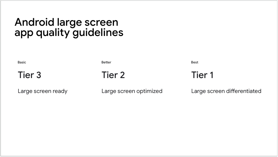
Android guidelines describe three tiers of large format device support.
Android 指南描述了大屏格式设备支持的三个层级。
{:width="90%"}
Tier 3, the lowest level of support,
includes support for mouse and stylus input
([Material 3 guidelines][m3-guide], [Apple guidelines][]).
第三层为最低支持级别,包括鼠标与触控笔输入([Material 3 指南][m3-guide]、[Apple 指南][Apple guidelines])。
If your app uses Material 3 and its buttons and selectors,
then your app already has built-in support for
various additional input states.
若应用使用 Material 3 及其按钮与选择器,则已内置对各种额外输入状态的支持。
But what if you have a custom widget?
Check out the [User input][] page for
guidance on adding
[input support for widgets][].
若有自定义 widget?请参阅 [User input][] 页了解如何添加 [widget 输入支持][input support for widgets]。
[Apple guidelines]: https://developer.apple.com/design/human-interface-guidelines/designing-for-ipados#Best-practices
[input support for widgets]: /ui/adaptive-responsive/input#custom-widgets
[m3-guide]: https://developer.android.google.cn/docs/quality-guidelines/large-screen-app-quality
[User input]: /ui/adaptive-responsive/input
### Navigation
### 导航
Navigation can create unique challenges when working with a variety of
differently-sized devices. Generally, you want to switch between
a [`BottomNavigationBar`][] and a [`NavigationRail`] depending on
available screen space.
在多种不同尺寸设备上工作时,导航可能带来独特挑战。
通常应根据可用屏幕空间在 [`BottomNavigationBar`][] 与 [`NavigationRail`][] 之间切换。
For more information (and corresponding example code),
check out [Problem: Navigation rail][], a section in the
[Developing Flutter apps for Large screens][article] article.
更多信息(及对应示例代码)请参阅文章 [Developing Flutter apps for Large screens][article]
中的 [Problem: Navigation rail][] 一节。
[article]: https://blog.flutter.dev/developing-flutter-apps-for-large-screens-53b7b0e17f10
[`BottomNavigationBar`]: https://api.flutter-io.cn/flutter/material/BottomNavigationBar-class.html
[`NavigationRail`]: https://api.flutter-io.cn/flutter/material/NavigationRail-class.html
[Problem: Navigation rail]: https://blog.flutter.dev/developing-flutter-apps-for-large-screens-53b7b0e17f10#:~:text=Problem%3A%20Navigation%20rail1