# 平台惯用法
> 了解如何创建能响应屏幕尺寸变化的 响应式应用。
The final area to consider for adaptive apps is platform standards.
Each platform has its own idioms and norms;
these nominal or de facto standards inform user expectations
of how an application should behave. Thanks, in part to the web,
users are accustomed to more customized experiences,
but reflecting these platform standards can still provide
significant benefits:
自适应应用还需考虑的最后一块是平台标准。
各平台有自己的惯用法与规范;这些名义上或事实上的标准塑造用户对应用应如何行为的预期。
部分得益于 Web,用户已习惯更定制的体验,但体现这些平台标准仍能带来显著好处:
* **Reduce cognitive load**
By matching the user's existing mental model,
accomplishing tasks becomes intuitive,
which requires less thinking,
boosts productivity, and reduces frustrations.
**降低认知负担**
通过匹配用户既有心智模型,完成任务更直观,减少思考、提升效率并降低挫败感。
* **Build trust**
Users can become wary or suspicious
when applications don't adhere to their expectations.
Conversely, a UI that feels familiar can build user trust
and can help improve the perception of quality.
This often has the added benefit of better app store
ratings—something we can all appreciate!
**建立信任**
应用不符合预期时用户可能警惕或怀疑。
反之,熟悉的 UI 能建立信任并提升质量感知,往往还能带来更好的应用商店评分——我们都乐见其成!
## Consider expected behavior on each platform
## 考虑各平台的预期行为
The first step is to spend some time considering what
the expected appearance, presentation,
or behavior is on this platform.
Try to forget any limitations of your current implementation,
and just envision the ideal user experience.
Work backwards from there.
第一步是花时间思考该平台上的预期外观、呈现或行为。
尽量忘记当前实现的限制,只设想理想用户体验,再倒推实现。
Another way to think about this is to ask,
"How would a user of this platform expect to achieve this goal?"
Then, try to envision how that would work in your app
without any compromises.
另一种思考方式是问:
「该平台用户会如何预期达成此目标?」然后设想在你的应用中如何无妥协地实现。
This can be difficult if you aren't a regular user of the platform.
You might be unaware of the specific idioms and can easily miss
them completely. For example, a lifetime Android user is
likely unaware of platform conventions on iOS,
and the same holds true for macOS, Linux, and Windows.
These differences might be subtle to you,
but be painfully obvious to an experienced user.
若你不是该平台的常用用户,这可能较难。
你可能不了解具体惯用法并完全遗漏。
例如,长期使用 Android 的用户可能不了解 iOS 平台惯例,macOS、Linux、Windows 同理。
这些差异对你可能细微,对资深用户却可能非常明显。
### Find a platform advocate
### 寻找平台倡导者
If possible, assign someone as an advocate for each platform.
Ideally, your advocate uses the platform as their primary device,
and can offer the perspective of a highly opinionated user.
To reduce the number of people, combine roles.
Have one advocate for Windows and Android,
one for Linux and the web, and one for Mac and iOS.
若可能,为每个平台指定一名倡导者。
理想情况下,倡导者以该平台为主要设备,并能提供挑剔用户的视角。
为减少人数可合并角色:一人负责 Windows 与 Android,一人负责 Linux 与 Web,一人负责 Mac 与 iOS。
The goal is to have constant, informed feedback so the app
feels great on each platform. Advocates should be encouraged
to be quite picky, calling out anything they feel differs from
typical applications on their device. A simple example is how
the default button in a dialog is typically on the left on Mac
and Linux, but is on the right on Windows.
Details like that are easy to miss if you aren't using a platform
on a regular basis.
目标是获得持续、专业的反馈,使应用在各平台都出色。
应鼓励倡导者挑剔,指出与设备上典型应用的差异。
简单例子:对话框默认按钮在 Mac 与 Linux 通常在左侧,Windows 则在右侧。
若不常用某平台,此类细节易被忽略。
:::secondary Important
Advocates don't need to be developers or
even full-time team members. They can be designers,
stakeholders, or external testers that are provided
with regular builds.
倡导者不必是开发者或全职成员,可以是设计师、利益相关方或定期获得构建的外部测试者。
:::
### Stay unique
### 保持独特
Conforming to expected behaviors doesn't mean that your app
needs to use default components or styling.
Many of the most popular multiplatform apps have very distinct
and opinionated UIs including custom buttons, context menus,
and title bars.
符合预期行为并不意味着必须使用默认 widget 或样式。
许多热门多平台应用有鲜明、主观的 UI,包括自定义按钮、上下文菜单与标题栏。
The more you can consolidate styling and behavior across platforms,
the easier development and testing will be.
The trick is to balance creating a unique experience with a
strong identity, while respecting the norms of each platform.
跨平台整合样式与行为越多,开发与测试越轻松。
诀窍是在打造强识别度的独特体验与尊重各平台规范之间取得平衡。
## Common idioms and norms to consider
## 常见惯用法与规范
Take a quick look at a few specific norms and idioms
you might want to consider, and how you could approach
them in Flutter.
快速浏览你可能要考虑的若干规范与惯用法,以及在 Flutter 中的实现思路。
### Scrollbar appearance and behavior
### 滚动条外观与行为
Desktop and mobile users expect scrollbars,
but they expect them to behave differently on different platforms.
Mobile users expect smaller scrollbars that only appear
while scrolling, whereas desktop users generally expect
omnipresent, larger scrollbars that they can click or drag.
桌面与移动用户都预期有滚动条,但各平台行为不同。
移动用户预期较小、仅在滚动时出现的滚动条;
桌面用户通常预期常驻、较大且可点击或拖动的滚动条。
Flutter comes with a built-in `Scrollbar` widget that already
has support for adaptive colors and sizes according to the
current platform. The one tweak you might want to make is to
toggle `alwaysShown` when on a desktop platform:
Flutter 自带 `Scrollbar` widget,已根据当前平台支持自适应颜色与尺寸。
你可能只需在桌面平台切换 `alwaysShown`:
```dart
return Scrollbar(
thumbVisibility: DeviceType.isDesktop,
controller: _scrollController,
child: GridView.count(
controller: _scrollController,
padding: const EdgeInsets.all(Insets.extraLarge),
childAspectRatio: 1,
crossAxisCount: colCount,
children: listChildren,
),
);
```
This subtle attention to detail can make your app feel more
comfortable on a given platform.
这些细节关注能让应用在给定平台上更舒适。
### Multi-select
### 多选
Dealing with multi-select within a list is another area
with subtle differences across platforms:
列表内多选是另一存在跨平台细微差异的领域:
```dart
static bool get isSpanSelectModifierDown =>
isKeyDown({LogicalKeyboardKey.shiftLeft, LogicalKeyboardKey.shiftRight});
```
To perform a platform-aware check for control or command,
you can write something like this:
要进行平台感知的 Control 或 Command 检查,可编写类似代码:
```dart
static bool get isMultiSelectModifierDown {
bool isDown = false;
if (Platform.isMacOS) {
isDown = isKeyDown({
LogicalKeyboardKey.metaLeft,
LogicalKeyboardKey.metaRight,
});
} else {
isDown = isKeyDown({
LogicalKeyboardKey.controlLeft,
LogicalKeyboardKey.controlRight,
});
}
return isDown;
}
```
A final consideration for keyboard users is the **Select All** action.
If you have a large list of items of selectable items,
many of your keyboard users will expect that they can use
`Control+A` to select all the items.
键盘用户还需考虑 **全选** 操作。若有大量可选列表项,许多键盘用户会预期可用 `Control+A` 全选。
#### Touch devices
#### 触控设备
On touch devices, multi-selection is typically simplified,
with the expected behavior being similar to having the
`isMultiSelectModifier` down on the desktop.
You can select or deselect items using a single tap,
and will usually have a button to **Select All** or
**Clear** the current selection.
在触控设备上,多选通常更简单,预期行为类似桌面按住 `isMultiSelectModifier`。
可用单击选择或取消选择,通常还有 **全选** 或 **清除** 当前选择的按钮。
How you handle multi-selection on different devices depends
on your specific use cases, but the important thing is to
make sure that you're offering each platform the best
interaction model possible.
不同设备上的多选处理取决于具体用例,重要的是为各平台提供最佳交互模型。
### Selectable text
### 可选中文本
A common expectation on the web (and to a lesser extent desktop)
is that most visible text can be selected with the mouse cursor.
When text is not selectable,
users on the web tend to have an adverse reaction.
Web(以及程度较轻的桌面)上常见预期是:大部分可见文字可用鼠标选中。
文字不可选时,Web 用户往往反感。
Luckily, this is easy to support with the [`SelectableText`][] widget:
幸运的是,用 [`SelectableText`][] widget 即可轻松支持:
```dart
return const SelectableText('Select me!');
```
To support rich text, then use `TextSpan`:
要支持富文本,请使用 `TextSpan`:
```dart
return const SelectableText.rich(
TextSpan(
children: [
TextSpan(text: 'Hello'),
TextSpan(
text: 'Bold',
style: TextStyle(fontWeight: FontWeight.bold),
),
],
),
);
```
[`SelectableText`]: https://api.flutter-io.cn/flutter/material/SelectableText-class.html
### Title bars
### 标题栏
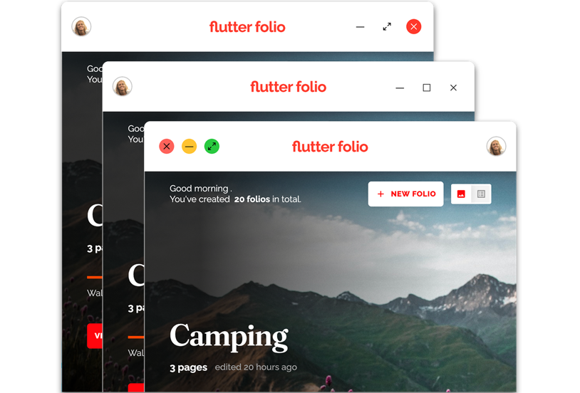
On modern desktop applications, it's common to customize
the title bar of your app window, adding a logo for
stronger branding or contextual controls to help save
vertical space in your main UI.
在现代桌面应用中,常见做法是自定义应用窗口标题栏,
添加 Logo 强化品牌或上下文控件以节省主 UI 垂直空间。
{:width="100%"}
This isn't supported directly in Flutter, but you can use the
[`bits_dojo`][] package to disable the native title bars,
and replace them with your own.
Flutter 不直接支持,但可用 [`bits_dojo`][] package 禁用原生标题栏并替换为自定义实现。
This package lets you add whatever widgets you want to the
`TitleBar` because it uses pure Flutter widgets under the hood.
This makes it easy to adapt the title bar as you navigate
to different sections of the app.
该 package 底层使用纯 Flutter widget,可在 `TitleBar` 中添加任意 widget,便于在应用不同区域导航时适配标题栏。
[`bits_dojo`]: https://github.com/bitsdojo/bitsdojo_window
### Context menus and tooltips
### 上下文菜单与工具提示
On desktop, there are several interactions that
manifest as a widget shown in an overlay,
but with differences in how they're triggered, dismissed,
and positioned:
在桌面上,若干交互以叠加层中的 widget 呈现,但触发、关闭与定位方式不同:
* **Context menu**
Typically triggered by a right-click,
a context menu is positioned close to the mouse,
and is dismissed by clicking anywhere,
selecting an option from the menu, or clicking outside it.
**上下文菜单**
通常由右键触发,靠近鼠标定位,通过任意点击、选择菜单项或点击外部关闭。
* **Tooltip**
Typically triggered by hovering for
200-400ms over an interactive element,
a tooltip is usually anchored to a widget
(as opposed to the mouse position) and is dismissed
when the mouse cursor leaves that widget.
**Tooltip(工具提示)**
通常在交互元素上悬停 200–400ms 触发,
一般锚定到 widget(而非鼠标位置),鼠标离开该 widget 时关闭。
* **Popup panel (also known as flyout)**
Similar to a tooltip,
a popup panel is usually anchored to a widget.
The main difference is that panels are most often
shown on a tap event, and they usually don't hide
themselves when the cursor leaves.
Instead, panels are typically dismissed by clicking
outside the panel or by pressing a **Close** or **Submit** button.
**弹出面板(亦称 flyout)**
与工具提示类似,通常锚定到 widget。
主要区别是面板多在点击时显示,光标离开通常不会自动隐藏,
而是通过点击面板外部或按 **关闭** / **提交** 按钮关闭。
To show basic tooltips in Flutter,
use the built-in [`Tooltip`][] widget:
在 Flutter 中显示基本工具提示,请使用内置 [`Tooltip`][] widget:
```dart
return const Tooltip(
message: 'I am a Tooltip',
child: Text('Hover over the text to show a tooltip.'),
);
```
Flutter also provides built-in context menus when editing
or selecting text.
Flutter 在编辑或选择文字时也提供内置上下文菜单。
To show more advanced tooltips, popup panels,
or create custom context menus,
you either use one of the available packages,
or build it yourself using a `Stack` or `Overlay`.
要显示更高级的工具提示、弹出面板或创建自定义上下文菜单,可使用现有 package,
或用 `Stack` 或 `Overlay` 自行构建。
Some available packages include:
部分可用 package 包括:
* [`context_menus`][]
* [`anchored_popups`][]
* [`flutter_portal`][]
* [`super_tooltip`][]
* [`custom_pop_up_menu`][]
While these controls can be valuable for touch users as accelerators,
they are essential for mouse users. These users expect
to right-click things, edit content in place,
and hover for more information. Failing to meet those expectations
can lead to disappointed users, or at least,
a feeling that something isn't quite right.
这些控件对触控用户可作为加速器很有价值,对鼠标用户则必不可少。
他们预期右键、就地编辑、悬停获取更多信息。
未满足这些预期会令用户失望,或至少觉得「哪里不对」。
[`anchored_popups`]: https://pub-web.flutter-io.cn/packages/anchored_popups
[`context_menus`]: https://pub-web.flutter-io.cn/packages/context_menus
[`custom_pop_up_menu`]: https://pub-web.flutter-io.cn/packages/custom_pop_up_menu
[`flutter_portal`]: https://pub-web.flutter-io.cn/packages/flutter_portal
[`super_tooltip`]: https://pub-web.flutter-io.cn/packages/super_tooltip
[`Tooltip`]: https://api.flutter-io.cn/flutter/material/Tooltip-class.html
### Horizontal button order
### 水平按钮顺序
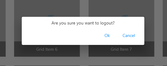
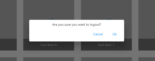
On Windows, when presenting a row of buttons,
the confirmation button is placed at the start of
the row (left side). On all other platforms,
it's the opposite. The confirmation button is
placed at the end of the row (right side).
在 Windows 上,一行按钮中确认按钮在行首(左侧)。
其他平台相反,确认按钮在行尾(右侧)。
This can be easily handled in Flutter using the
`TextDirection` property on `Row`:
在 Flutter 中可用 `Row` 的 `TextDirection` 属性轻松处理:
```dart
TextDirection btnDirection = DeviceType.isWindows
? TextDirection.rtl
: TextDirection.ltr;
return Row(
children: [
const Spacer(),
Row(
textDirection: btnDirection,
children: [
DialogButton(
label: 'Cancel',
onPressed: () => Navigator.pop(context, false),
),
DialogButton(
label: 'Ok',
onPressed: () => Navigator.pop(context, true),
),
],
),
],
);
```
{:width="75%"}
{:width="90%"}
### Menu bar
### 菜单栏
Another common pattern on desktop apps is the menu bar.
On Windows and Linux, this menu lives as part of the Chrome title bar,
whereas on macOS, it's located along the top of the primary screen.
桌面应用另一常见模式是菜单栏。
Windows 与 Linux 上菜单是 Chrome 标题栏的一部分,
macOS 上则位于主屏幕顶部。
Currently, you can specify custom menu bar entries using
a prototype plugin, but it's expected that this functionality will
eventually be integrated into the main SDK.
目前可用原型插件指定自定义菜单栏项,预计该功能最终会并入主 SDK。
It's worth mentioning that on Windows and Linux,
you can't combine a custom title bar with a menu bar.
When you create a custom title bar,
you're replacing the native one completely,
which means you also lose the integrated native menu bar.
值得一提的是,Windows 与 Linux 上无法将自定义标题栏与菜单栏并存。
创建自定义标题栏会完全替换原生标题栏,因而也会失去集成的原生菜单栏。
If you need both a custom title bar and a menu bar,
you can achieve that by implementing it in Flutter,
similar to a custom context menu.
若同时需要自定义标题栏与菜单栏,可在 Flutter 中实现,类似自定义上下文菜单。
### Drag and drop
### 拖放
One of the core interactions for both touch-based and
pointer-based inputs is drag and drop. Although this
interaction is expected for both types of input,
there are important differences to think about when
it comes to scrolling lists of draggable items.
触控与指针输入的核心交互之一是拖放。
两种输入都预期有此交互,但在可滚动可拖放列表上存在重要差异。
Generally speaking, touch users expect to see drag handles
to differentiate draggable areas from scrollable ones,
or alternatively, to initiate a drag by using a long
press gesture. This is because scrolling and dragging
are both sharing a single finger for input.
一般而言,触控用户预期看到拖动手柄以区分可拖区域与可滚动区域,
或通过长按启动拖动,因为滚动与拖动共用单指输入。
Mouse users have more input options. They can use a wheel
or scrollbar to scroll, which generally eliminates the need
for dedicated drag handles. If you look at the macOS
Finder or Windows Explorer, you'll see that they work
this way: you just select an item and start dragging.
鼠标用户输入选项更多,可用滚轮或滚动条滚动,通常无需专用拖动手柄。
macOS Finder 或 Windows 资源管理器即如此:选中项即可拖动。
In Flutter, you can implement drag and drop in many ways.
Discussing specific implementations is outside
the scope of this article, but some high level options
include the following:
在 Flutter 中可用多种方式实现拖放。
具体实现超出本文范围,高层选项包括:
* Use the [`Draggable`][] and [`DragTarget`][] APIs
directly for a custom look and feel.
直接使用 [`Draggable`][] 与 [`DragTarget`][] API 实现自定义外观。
* Hook into `onPan` gesture events,
and move an object yourself within a parent `Stack`.
接入 `onPan` 手势事件,在父 `Stack` 中自行移动对象。
* Use one of the [pre-made list packages][] on pub.dev.
使用 pub.dev 上的 [预制列表 package][pre-made list packages]。
[`Draggable`]: https://api.flutter-io.cn/flutter/widgets/Draggable-class.html
[`DragTarget`]: https://api.flutter-io.cn/flutter/widgets/DragTarget-class.html
[pre-made list packages]: https://pub-web.flutter-io.cn/packages?q=reorderable+list