# 创建 widget
> 了解无状态 widget 以及如何构建你自己的 widget。
Learn to create custom widgets and use the most common SDK widgets like
Container, Center, and Text.
学习创建自定义 widget,并使用最常见的 SDK widget,
例如 Container、Center 和 Text。
title: 你将完成的内容
items:
- title: 创建自定义 StatelessWidget
icon: widgets
- title: 通过构造函数参数使 widget 可复用
icon: tune
- title: 使用 Container 和 BoxDecoration 为 widget 设置样式
icon: palette
---
### 开始之前
This app relies on a bit of game logic that isn't UI-related,
and thus is outside the scope of this tutorial.
Before you move on, you need to add this logic to your app.
本应用依赖一些与 UI 无关的游戏逻辑,
因此不在本教程范围内。
在继续之前,你需要将此逻辑添加到你的应用中。
1. Download the following Dart file and save it
as `lib/game.dart` in your project directory.
下载以下 Dart 文件,并将其保存为
项目目录中的 `lib/game.dart`。
1. To enable access to the types defined in the `game.dart` library,
add an import to it from your `lib/main.dart` file:
要访问 `game.dart` 库中定义的类型,
请在你的 `lib/main.dart` 文件中添加对它的 import:
```dart title="main.dart" highlightLines=3
import 'package:flutter/material.dart';
import 'game.dart';
```
:::note 游戏逻辑说明
You might notice the
`legalGuesses` and `legalWords` lists only contain a few words.
The full lists combined have over 10,000 words and were omitted for brevity.
You don't need the full lists to continue the tutorial.
When you're testing your app, make sure to use the words from those lists.
你可能会注意到
`legalGuesses` 和 `legalWords` 列表只包含少量单词。
完整列表合计超过 10,000 个单词,为简洁起见已省略。
你无需完整列表即可继续本教程。
测试应用时,请确保使用这些列表中的单词。
Alternatively, you can find the full lists in
[this GitHub repository][full-words], as well as
instructions to import it into your project.
或者,你可以在
[此 GitHub 仓库][full-words] 中找到完整列表,
以及将其导入项目的说明。
:::
[full-words]: https://github.com/ericwindmill/legal_wordle_words
### StatelessWidget 的结构
A `Widget` is a Dart class that extends one of the Flutter widget classes,
in this case [`StatelessWidget`][].
`Widget` 是一个继承 Flutter widget 类之一的 Dart 类,
此处为 [`StatelessWidget`][]。
Open your `main.dart` file and add this code below the `MainApp` class,
which defines a new widget called `Tile`.
打开 `main.dart` 文件,在 `MainApp` 类下方添加以下代码,
其中定义了一个名为 `Tile` 的新 widget。
```dart
class Tile extends StatelessWidget {
const Tile(this.letter, this.hitType, {super.key});
final String letter;
final HitType hitType;
@override
Widget build(BuildContext context) {
return Container();
}
}
```
[`StatelessWidget`]: https://api.flutter-io.cn/flutter/widgets/StatelessWidget-class.html
#### 构造函数
The `Tile` class has a [constructor][] that defines
what data needs to be passed into the widget to render the widget.
In this case, the constructor accepts two parameters:
`Tile` 类有一个 [constructor][],用于定义
渲染 widget 时需要传入哪些数据。
此处,构造函数接受两个参数:
- A `String` representing the guessed letter of the tile.
表示方块猜测字母的 `String`。
- A `HitType` [enum value][] represent the guess result and
used to determine the color of the tile.
For example, `HitType.hit` results in a green tile.
表示猜测结果的 `HitType` [enum value][],
用于确定方块颜色。
例如,`HitType.hit` 会得到绿色方块。
Passing data into widget constructors is at the core of making widgets reusable.
向 widget 构造函数传入数据是使 widget 可复用的核心。
[constructor]: https://dart.cn/language/constructors
[enum value]: https://dart.cn/language/enums
#### Build 方法
Finally, there's the all important `build` method, which must be defined on
every widget, and will always return another widget.
最后,还有至关重要的 `build` 方法,每个 widget 都必须定义它,
且它始终返回另一个 widget。
```dart
class Tile extends StatelessWidget {
const Tile(this.letter, this.hitType, {super.key});
final String letter;
final HitType hitType;
@override
Widget build(BuildContext context) {
// TODO: Replace Container with widgets.
return Container();
}
}
```
### 使用自定义 widget
When the app is finished,
there will be 25 instances of this widget on the screen.
For now, though, display just one so you can see the updates as they're made.
In the `MainApp.build` method, replace the `Text` widget with the following:
应用完成后,
屏幕上将有 25 个此 widget 的实例。
不过现在只显示一个,以便你能看到每次更新。
在 `MainApp.build` 方法中,将 `Text` widget 替换为以下内容:
```dart
class MainApp extends StatelessWidget {
const MainApp({super.key});
@override
Widget build(BuildContext context) {
return const MaterialApp(
home: Scaffold(
body: Center(
child: Tile('A', HitType.hit), // NEW
),
),
);
}
}
```
At the moment, your app will be blank,
because the `Tile` widget returns an empty `Container`,
which doesn't display anything by default.
目前,你的应用会是空白的,
因为 `Tile` widget 返回空的 `Container`,
默认情况下不会显示任何内容。
### `Container` widget
The `Tile` widget consists of three of the most common core widgets:
`Container`, `Center`, and `Text`.
[`Container`][] is a convenience widget that wraps several core styling widgets,
such as [`Padding`][], [`ColoredBox`][], [`SizedBox`][], and [`DecoratedBox`][].
`Tile` widget 由三个最常见的核心 widget 组成:
`Container`、`Center` 和 `Text`。
[`Container`][] 是一个便捷 widget,封装了多个核心样式 widget,
例如 [`Padding`][]、[`ColoredBox`][]、[`SizedBox`][] 和 [`DecoratedBox`][]。
Because the finished UI contains 25 `Tile` widgets in neat columns and rows,
it should have an explicit size.
Set the width and height properties on the `Container`.
(You could also do this with a `SizedBox` widget, but you'll use
more properties of the `Container` next.)
因为完成的 UI 包含 25 个整齐排列的 `Tile` widget,
它应有明确尺寸。
在 `Container` 上设置 width 和 height 属性。
(你也可以用 `SizedBox` widget 实现,但接下来你会用到 `Container` 的更多属性。)
```dart
class Tile extends StatelessWidget {
const Tile(this.letter, this.hitType, {super.key});
final String letter;
final HitType hitType;
@override
Widget build(BuildContext context) {
// NEW
return Container(
width: 60,
height: 60,
// TODO: Add needed widgets
);
}
}
```
[`Container`]: https://api.flutter-io.cn/flutter/widgets/Container-class.html
[`Padding`]: https://api.flutter-io.cn/flutter/widgets/Padding-class.html
[`ColoredBox`]: https://api.flutter-io.cn/flutter/widgets/ColoredBox-class.html
[`SizedBox`]: https://api.flutter-io.cn/flutter/widgets/SizedBox-class.html
[`DecoratedBox`]: https://api.flutter-io.cn/flutter/widgets/DecoratedBox-class.html
### BoxDecoration 装饰
Next, add a [`Border`][] to the box with the following code:
接下来,使用以下代码为方块添加 [`Border`][]:
```dart
class Tile extends StatelessWidget {
const Tile(this.letter, this.hitType, {super.key});
final String letter;
final HitType hitType;
@override
Widget build(BuildContext context) {
// NEW
return Container(
width: 60,
height: 60,
decoration: BoxDecoration(
border: Border.all(color: Colors.grey.shade300),
// TODO: add background color
),
);
}
}
```
`BoxDecoration` is an object that knows how to
add any number of decorations to a widget, from
background color to borders to box shadows and more.
In this case, you've added a border.
When you hot reload, there should be
a lightly colored border around the white square.
`BoxDecoration` 是一个知道如何为 widget 添加多种装饰的对象,
从背景色到边框、盒子阴影等。
此处,你添加了边框。
热重载后,白色方块周围应出现浅色边框。
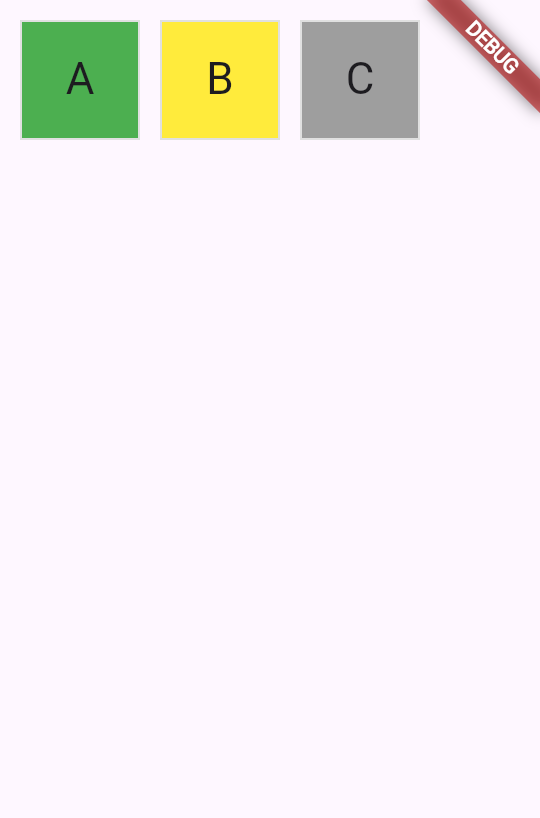
When this game is complete,
the color of the tile will depend on the user's guess.
The tile will be green when the user has guessed correctly,
yellow when the letter is correct but the position is incorrect, and
gray if the guess is wrong in both respects.
游戏完成后,
方块颜色将取决于用户的猜测。
用户猜对时方块为绿色,
字母正确但位置错误时为黄色,
字母和位置都错误时为灰色。
The following figure shows all three possibilities.
下图展示了三种情况。
 To achieve this in UI, use a [switch expression][] to
set the `color` of the `BoxDecoration`.
要在 UI 中实现这一点,
使用 [switch expression][] 设置 `BoxDecoration` 的 `color`。
```dart
class Tile extends StatelessWidget {
const Tile(this.letter, this.hitType, {super.key});
final String letter;
final HitType hitType;
@override
Widget build(BuildContext context) {
return Container(
width: 60,
height: 60,
decoration: BoxDecoration(
border: Border.all(color: Colors.grey.shade300),
color: switch (hitType) {
HitType.hit => Colors.green,
HitType.partial => Colors.yellow,
HitType.miss => Colors.grey,
_ => Colors.white,
},
// TODO: add children
),
);
}
}
```
[`Border`]: https://api.flutter-io.cn/flutter/widgets/Container-class.html
[switch expression]: https://dart.cn/language/branches#switch-expressions
### 子 widget
Finally, add the `Center` and `Text` widgets to the `Container.child` property.
最后,将 `Center` 和 `Text` widget 添加到 `Container.child` 属性。
Most widgets in the Flutter SDK have a `child` or `children` property that's
meant to be passed a widget or a list of widgets, respectively.
It's the best practice to use the same naming convention in
your own custom widgets.
Flutter SDK 中的大多数 widget 都有 `child` 或 `children` 属性,
分别用于传入 widget 或 widget 列表。
在自己的自定义 widget 中使用相同的命名约定是最佳实践。
```dart
class Tile extends StatelessWidget {
const Tile(this.letter, this.hitType, {super.key});
final String letter;
final HitType hitType;
@override
Widget build(BuildContext context) {
return Container(
width: 60,
height: 60,
decoration: BoxDecoration(
border: Border.all(color: Colors.grey.shade300),
color: switch (hitType) {
HitType.hit => Colors.green,
HitType.partial => Colors.yellow,
HitType.miss => Colors.grey,
_ => Colors.white,
},
),
child: Center(
child: Text(
letter.toUpperCase(),
style: Theme.of(context).textTheme.titleLarge,
),
),
);
}
}
```
Hot reload and a green box appears. To toggle the color,
update and hot reload the `HitType` passed into the `Tile` you created:
热重载后会出现绿色方块。要切换颜色,
更新并热重载传入你创建的 `Tile` 的 `HitType`:
```dart
// main.dart line ~16
// green
Tile('A', HitType.hit);
// grey
Tile('A', HitType.miss);
// yellow
Tile('A', HitType.partial);
```
Soon, this small box will be one of many widgets on the screen. In the next
lesson, you'll start building the game grid itself.
很快,这个小方块将成为屏幕上众多 widget 之一。在下一课中,
你将开始构建游戏网格本身。
### 回顾
title: 你完成的内容
subtitle: 以下是你本课构建与学习内容的摘要。
completed: true
items:
- title: 构建了自定义 StatelessWidget
icon: widgets
details: >-
你通过扩展 `StatelessWidget` 创建了新的 `Tile` widget。
每个 widget 都有用于接收数据的构造函数和
返回其他 widget 的 `build` 方法。
此模式是 Flutter 构建用户界面的基础。
- title: 通过构造函数参数使 widget 可复用
icon: tune
details: >-
通过将 `letter` 和 `hitType` 作为构造函数参数,
你的 `Tile` widget 可以显示不同内容和颜色。
通过构造函数传递数据是
创建灵活、可复用组件的方式。
- title: 使用 Container 和 BoxDecoration 为 widget 设置样式
icon: palette
details: >-
你使用 `Container` 设置 widget 尺寸,使用
`BoxDecoration` 添加边框和背景色。
然后通过对 `hitType` 值使用 switch 表达式
有条件地设置方块颜色。
### 自测
- question: "每个 Flutter widget 的 `build` 方法必须返回什么?"
options:
- text: 描述 widget 的 String。
correct: false
explanation: "`build` 方法返回 widget,而非 String。"
- text: 另一个 widget。
correct: true
explanation: "`build` 方法始终返回另一个 widget,该 widget 构成 widget 树的一部分。"
- text: 表示成功或失败的 boolean。
correct: false
explanation: widget 不表示成功与否;它们返回要渲染的其他 widget。
- text: 若无内容可显示则返回 null。
correct: false
explanation: "`build` 方法不能返回 null;它必须返回有效的 widget。"
- question: 哪个对象用于向 Container 添加边框、背景色和阴影等装饰?
options:
- text: ThemeData
correct: false
explanation: ThemeData 用于应用级样式,而非单个 container 的装饰。
- text: TextStyle
correct: false
explanation: TextStyle 用于文本格式,而非 container 装饰。
- text: BoxDecoration
correct: true
explanation: BoxDecoration 可为 Container 添加边框、背景色、渐变、阴影等。
- text: EdgeInsets
correct: false
explanation: EdgeInsets 用于指定内边距或外边距,而非视觉装饰。
To achieve this in UI, use a [switch expression][] to
set the `color` of the `BoxDecoration`.
要在 UI 中实现这一点,
使用 [switch expression][] 设置 `BoxDecoration` 的 `color`。
```dart
class Tile extends StatelessWidget {
const Tile(this.letter, this.hitType, {super.key});
final String letter;
final HitType hitType;
@override
Widget build(BuildContext context) {
return Container(
width: 60,
height: 60,
decoration: BoxDecoration(
border: Border.all(color: Colors.grey.shade300),
color: switch (hitType) {
HitType.hit => Colors.green,
HitType.partial => Colors.yellow,
HitType.miss => Colors.grey,
_ => Colors.white,
},
// TODO: add children
),
);
}
}
```
[`Border`]: https://api.flutter-io.cn/flutter/widgets/Container-class.html
[switch expression]: https://dart.cn/language/branches#switch-expressions
### 子 widget
Finally, add the `Center` and `Text` widgets to the `Container.child` property.
最后,将 `Center` 和 `Text` widget 添加到 `Container.child` 属性。
Most widgets in the Flutter SDK have a `child` or `children` property that's
meant to be passed a widget or a list of widgets, respectively.
It's the best practice to use the same naming convention in
your own custom widgets.
Flutter SDK 中的大多数 widget 都有 `child` 或 `children` 属性,
分别用于传入 widget 或 widget 列表。
在自己的自定义 widget 中使用相同的命名约定是最佳实践。
```dart
class Tile extends StatelessWidget {
const Tile(this.letter, this.hitType, {super.key});
final String letter;
final HitType hitType;
@override
Widget build(BuildContext context) {
return Container(
width: 60,
height: 60,
decoration: BoxDecoration(
border: Border.all(color: Colors.grey.shade300),
color: switch (hitType) {
HitType.hit => Colors.green,
HitType.partial => Colors.yellow,
HitType.miss => Colors.grey,
_ => Colors.white,
},
),
child: Center(
child: Text(
letter.toUpperCase(),
style: Theme.of(context).textTheme.titleLarge,
),
),
);
}
}
```
Hot reload and a green box appears. To toggle the color,
update and hot reload the `HitType` passed into the `Tile` you created:
热重载后会出现绿色方块。要切换颜色,
更新并热重载传入你创建的 `Tile` 的 `HitType`:
```dart
// main.dart line ~16
// green
Tile('A', HitType.hit);
// grey
Tile('A', HitType.miss);
// yellow
Tile('A', HitType.partial);
```
Soon, this small box will be one of many widgets on the screen. In the next
lesson, you'll start building the game grid itself.
很快,这个小方块将成为屏幕上众多 widget 之一。在下一课中,
你将开始构建游戏网格本身。
### 回顾
title: 你完成的内容
subtitle: 以下是你本课构建与学习内容的摘要。
completed: true
items:
- title: 构建了自定义 StatelessWidget
icon: widgets
details: >-
你通过扩展 `StatelessWidget` 创建了新的 `Tile` widget。
每个 widget 都有用于接收数据的构造函数和
返回其他 widget 的 `build` 方法。
此模式是 Flutter 构建用户界面的基础。
- title: 通过构造函数参数使 widget 可复用
icon: tune
details: >-
通过将 `letter` 和 `hitType` 作为构造函数参数,
你的 `Tile` widget 可以显示不同内容和颜色。
通过构造函数传递数据是
创建灵活、可复用组件的方式。
- title: 使用 Container 和 BoxDecoration 为 widget 设置样式
icon: palette
details: >-
你使用 `Container` 设置 widget 尺寸,使用
`BoxDecoration` 添加边框和背景色。
然后通过对 `hitType` 值使用 switch 表达式
有条件地设置方块颜色。
### 自测
- question: "每个 Flutter widget 的 `build` 方法必须返回什么?"
options:
- text: 描述 widget 的 String。
correct: false
explanation: "`build` 方法返回 widget,而非 String。"
- text: 另一个 widget。
correct: true
explanation: "`build` 方法始终返回另一个 widget,该 widget 构成 widget 树的一部分。"
- text: 表示成功或失败的 boolean。
correct: false
explanation: widget 不表示成功与否;它们返回要渲染的其他 widget。
- text: 若无内容可显示则返回 null。
correct: false
explanation: "`build` 方法不能返回 null;它必须返回有效的 widget。"
- question: 哪个对象用于向 Container 添加边框、背景色和阴影等装饰?
options:
- text: ThemeData
correct: false
explanation: ThemeData 用于应用级样式,而非单个 container 的装饰。
- text: TextStyle
correct: false
explanation: TextStyle 用于文本格式,而非 container 装饰。
- text: BoxDecoration
correct: true
explanation: BoxDecoration 可为 Container 添加边框、背景色、渐变、阴影等。
- text: EdgeInsets
correct: false
explanation: EdgeInsets 用于指定内边距或外边距,而非视觉装饰。